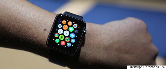
Why is the Apple watch a rectangle?
Because “a circle doesn’t make any sense”.
That’s the verdict of Apple design chief Jony Ive, according to a new profile published this week by the New Yorker.
In the piece Ive, whose title is Senior Vice President of Industrial Design, says that since a “a huge part of the function [of the watch] is lists” it can’t be efficient to turn the watch itself into a circle.
He also admits that he helped to design the lightsaber in the new Star Wars film.

In the piece Ive offers some interesting, arguably confusing thoughts about the asymmetrical placement of the ‘digital crown’ on the watch:
“It’s just literal. And you could say, ‘Why is that an issue?’ Well, if it’s literally referencing what’s happened in the past, the information about what it does is then wrong.”

In the piece Ive says that good design is about creating “the strangely familiar” - in the case of the Apple Watch, a timepiece that has its own function and design, but is a clear, recognisable descendent of the past.
On the iPhone 6 Plus Ive said that Apple went through many designs to get the final 5.5-inch screen size.
“The first one we really felt good about was a 5.7,” he recalled. “And then, sleeping on it, and coming back to it, it was just ‘Ah, that’s way too big.’ And then 5.6 still seems too big.”
Needless to say, the full article is an absolute must-read, and it’s the insights into Ive’s character (not his tidbits of info about the watch) which make for the compelling material.