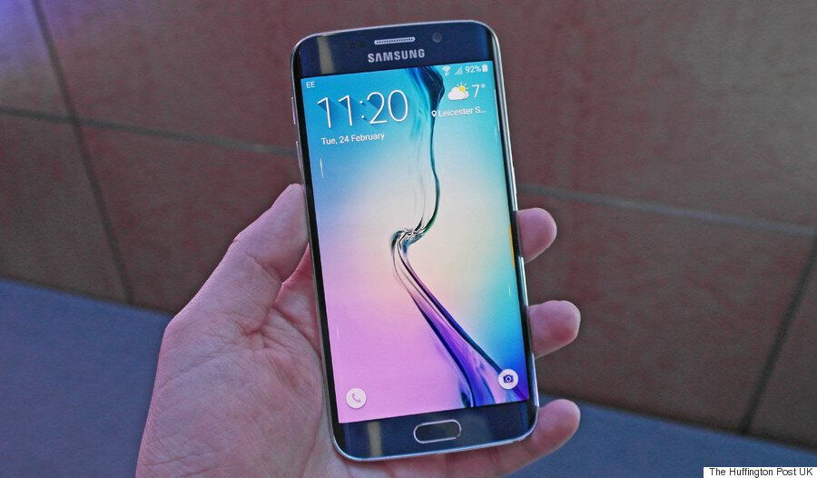
When Samsung unveiled the Galaxy S6 and Galaxy S6 edge at Mobile World Congress 2015 there was only one phone that everyone flocked to see afterwards. We'll give you a clue, it wasn't the one with the flat screen.
It's safe to say that had HTC not unveiled its potentially game-changing virtual reality headset HTC Vive, the Galaxy S6 edge would have stolen the show entirely. With its unfeasibly high-resolution curved screen, ultra-thin glass and metal body and an Apple Pay rival in the form of Samsung Pay it was easy to picture this as the phone that would put Samsung back on top.
Well as I found out, it has, but not in the way that you expect. The days of specs-hunting are over, every flagship smartphone whether it's the HTC One M9, Xperia Z3 or LG G Flex 2, they all perform just as well.
No, instead smartphone makers are realising that they need to appeal to another side of you; your vanity, and if there's one thing that can do that, it's a curved display.
Design
Firstly, lets look at the design. The S4 and the S5 were not attractive phones, while they had an abundance of flashy features that fake metal plastic and 'leather' design was too much.
With the S6 the company has ditched all that in favour of actual metal, replacing the 'leather' with beautifully smooth Gorilla Glass and sapphire crystal. It's impressively light and feels utterly solid in its construction.
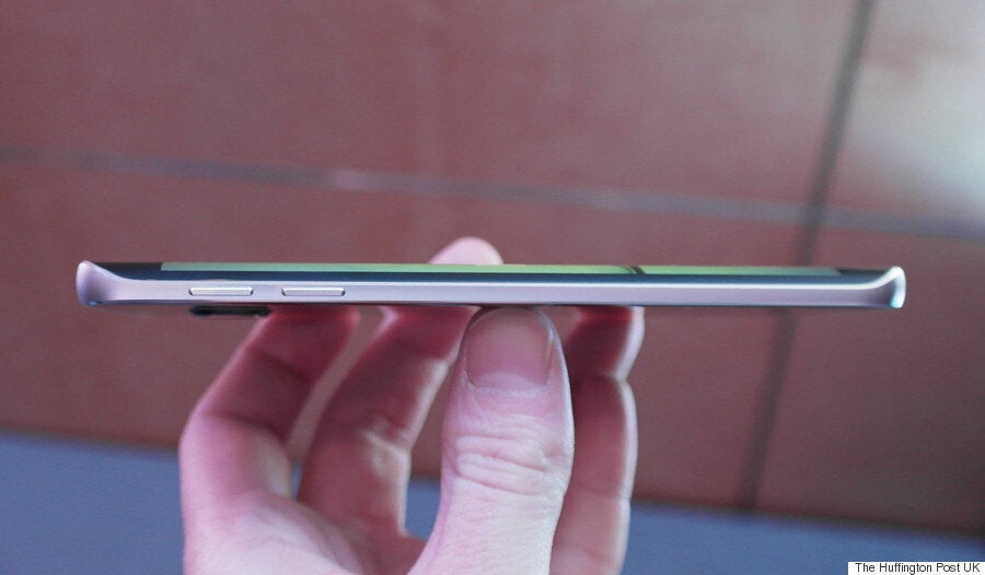
Imagine you went on a night out in Venice carrying a circuit board, and in quick succession drunkenly stumbled through the window of a master glassblower's and then finally -- out of sheer good luck -- collapsed into a vat of ultra-high purity aluminium. While you've severely irritated both a master glassblower and a metallurgist what you've ended up with is the best-looking phone Samsung has ever made.
It's a shame that Project Zero wasn't born out of a particularly hazy night out in Venice, irrespective of its origins the S6 edge has all the makings of a design icon.
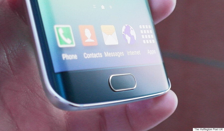
Now at this point I would -- at the very least -- kick Samsung for their awful colour choices but actually I can't. While the gold and white models make me deeply uncomfortable with their brashness, Samsung has balanced this with a stunning deep green that looks at home on the side of an old two-seater Triumph. The black fares just as well, exuding smartness.
Display
Having harked on about the design for four paragraphs longer than I should I'll turn to the centrepiece of the phone: that curved screen.
While LG, Samsung (and quite unintentionally Apple) have experimented with curving their phones it seems to me that the S6 edge's approach is the most logical. I've long been a hater of bezel-thick phones. Having gradually accepted that phones are getting bigger it seems sensible to make sure the entire surface is filled with something useful, like a screen.
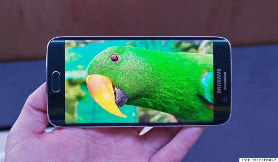
The dual edge display solves this problem, not by removing a bezel, but instead by putting it on the side of the phone. The curve is more subtle than it appears in pictures, so don't be under any illusions, it's not a full wraparound effect.
It's safe to say that the Galaxy S6 edge has one of the highest-resolution displays on a smartphone, and frankly we couldn't care less. There reaches a certain point where your eyes sigh, inevitably sending the following signals to your brain: "No, I can't see any pixels, it's all very impressive." You won't be able to tell the difference, no matter what anyone tells you.
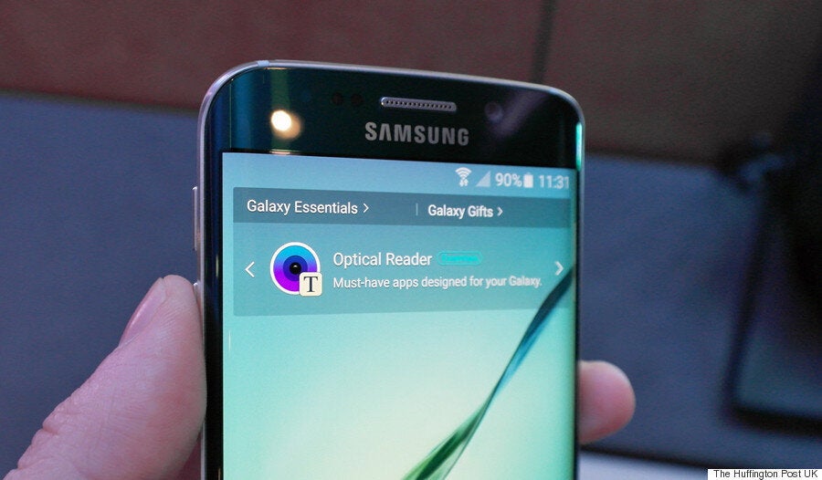
What matters is the quality of the display, whether whites are beautifully crisp and dark blacks hit you with the intensity of a newly formed black hole. The edge's 5.1-inch 2560x1440 display succeeds in both these arenas, the screen is beautifully clear, stunningly bright and colour reproduction is now on par with -- if not better than -- Sony's phones.
So the screen is excellent, what about the software and performance? Well this is where I can finally say something less than complimentary.
Software
The S6 edge runs Android, but does so with Samsung's TouchWiz overlay. It's frankly outdated in how it looks and while I was told that keeping the icons enables 'consistency', that doesn't fly when you've just released your least consistent phone in six years. The apps themselves have thankfully been given an update, and while they shine through, those icons -- in my opinion -- need to go.
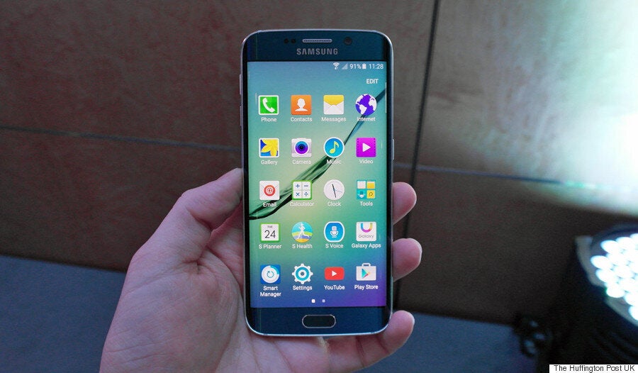
The S6 edge comes with two software extras that make use of the screen's curve. People Edge causes your phone to emit a coloured glow when face down using the edges, five colours are then assigned to a contact. Info Stream simply lights up at night showing the time, notifications and lets you swipe through messages.
Both are neat in their own way but are by no means changing the way I use a phone.
READ MORE:
Power & Battery
In terms of performance it's one of the fastest phones I've ever used. With a blindingly quick 64-bit processor and next-generation RAM, saving images, multi-tasking and high-powered games are limited only by your speed of interaction.
All this power then should surely affect the battery and the answer is yes, it does. With heavy usage you'll be lucky if you get a day out of the S6 edge, with moderate use you should able to make it home from a night out down the local with your newly befriended glassblower.
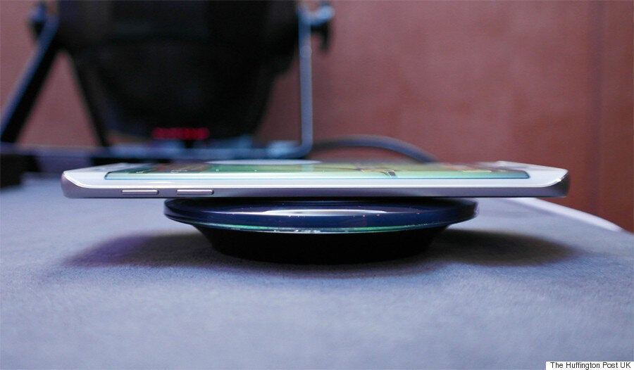
This is not a phone of endurance, it's about quick charges at points which are convenient. It'll charge on any wireless charging pad and, if you use the charger in the box, will give you four hours of battery life from 10 minutes charge.
The problem there is that we didn't have the right charger, so we had to make do with a normal one. In this instance we found it charged fully in around three to four hours which is pretty standard for a flagship smartphone.
Camera
Double tap the home button and you'll boot the 16MP rear-facing camera instantly. It's a great feature that makes full use of the phone's power.
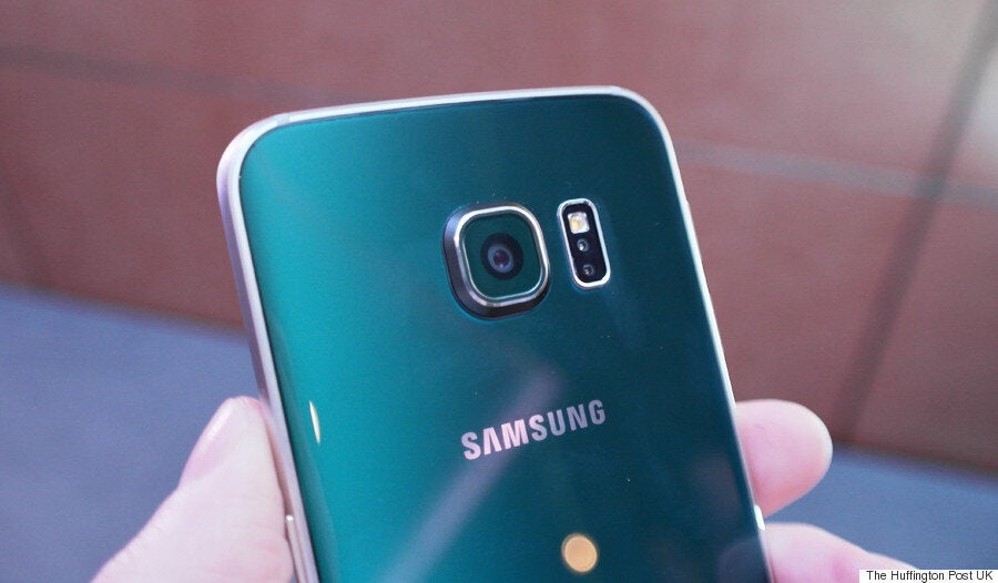
Image quality is really impressive as well, the photos were sharp and bright, focusing was quick. Can it replace your compact? Almost certainly, if you haven't done that already.
Verdict:

The S6 edge isn't without its faults; TouchWiz is ugly, that all-glass design looks like it'll be a magnet for cracks and then there's the price: £760 for the 64GB version. That's a lot of money in today's world. To put that into perspective, it's over £150 more expensive than the 128GB iPhone 6.
This then, is not a phone that you consider buying on a whim. In the same way that you'd buy a beautiful car, or anything from Bang&Olufsen you're paying as much for the design as you are the performance. It is then a purchase that's based on emotion, because the only thing that's going to justify that cost is how it'll make you feel every time you pick it up and use it. In that respect, it's almost unbeatable.
Key Features:
- 5.1-inch Quad HD 2560x1440 Super AMOLED Dual Edge display
- 14nm Octa-core 64-bit processor
- 16MP Rear-facing camera, 5MP front-facing camera
- Wireless charging (via both standards)
- 7mm thin
- Android 5.0 Lollipop
