The Washington Post recently ran a story on mapping 'the oldest and youngest states in America', exploring the geography of the generations, from Generation Z (0 to 14 years old) to the so-called 'Greatest Generation' (aged 70 and above). We can argue about the categories all we like, but the maps were quite striking and tell an important story of demographic distribution across the United States. This got me thinking about the UK and what the patterns look like here. Equipped with mid-year population estimates for 2014, a healthy dose of curiosity, and a few spare hours, I decided to replicate the analysis for the UK. Here's what I did...
I took the 2014 population estimates for all 391 UK local authority areas and then added up the population in each age category, as follows: 0 to 14 years (Generation Z), 15 to 29 (Generation Y), 30-49 (Generation X), 50-69 (Baby Boomers) and those aged 70 or above. I then calculated the largest single generation in each area and mapped the whole country in this way. The results are shown in the map below, and it's immediately clear that Generation X and Baby Boomers dominate, being the largest category in 212 and 166 areas respectively. This is to be expected, since these two categories contain the widest age bands, but the geography of generations is quite interesting.
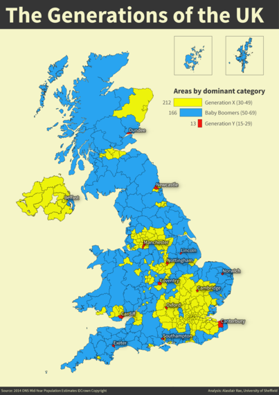
In all but one of Northern Ireland's areas, Generation X is the dominant category, South East England is an almost uninterrupted swathe of Generation X areas and there's a continuous cluster of Generation X running from the West Midlands up to the North West of England. The Valleys of South Wales, much of the Central Belt and north east Scotland, in addition to English cities like Hull, Bristol and Plymouth all show Generation X as the dominant category. This contrasts with the Baby Boomers, who mainly form the majority demographic in suburban and rural areas of the UK.
There are also 13 areas across the UK where Generation Y (15-29) is the dominant category. These tend to be towns and cities with high student populations, like Manchester, Cardiff and Southampton, and they are distributed quite widely across Great Britain, from Dundee in the north, to Exeter in the South.
So far, so good, but maps definitely don't tell the whole story and there is sometimes a fine balance between categories, so I dug a little deeper. Across the UK as a whole, 27.9% of people fall into the Generation X category (30-49), 22.2% are Baby Boomers (50-59), 20.9% are in Generation Y (15-29) and 18.1% in Generation Z (0-14). 10.8% are aged 70 or over according to the 2014 population estimates.
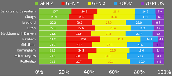
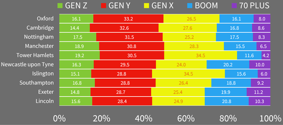
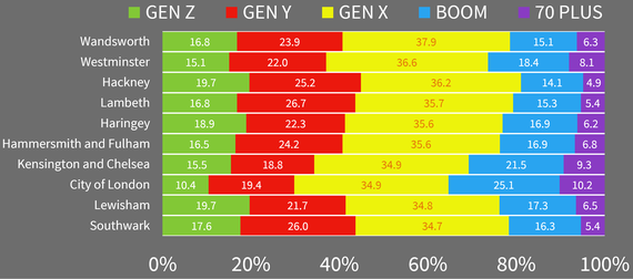
At the local level, there is considerable variation between places. For example, 25.7% of people in Barking and Dagenham are in Generation Z, in contrast to just 10.4% in the City of London. Oxford and Cambridge come out top for Generation Y, with 33.2% and 32.6%, followed by Nottingham (31.5%), Manchester (30.8%) and Tower Hamlets (30.5%). Wandsworth and Westminster come out top for Generation X, with 37.9% and 36.6% respectively. West Somerset, at 32.5%, comes out top in the Baby Boomers category and Christchurch on England's south coast is top for those aged 70 plus, at 22.7% of all residents.
To provide a simple visual overview of the balance between generations in different places, I've produced a series of charts, showing the demographic balance for the top 10 areas in each category, from Generation Z to 70 plus. I've also put all of this into one megachart at the very end containing all 391 local authorities in the UK, arranged alphabetically. This provides a quick visual overview of the demographic distribution by individual area.
Generation Z Top 10
Generation Y Top 10
Generation X Top 10
Baby Boomers Top 10
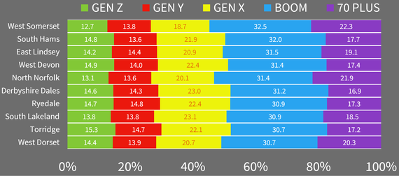
70 Plus Top 10
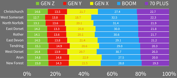
This is all very interesting, but why does any of it matter? There are many reasons, but I'll end with two. First, the ageing of the UK population has serious implications for how we provide local services, particularly healthcare. As you can see from the data, the demographic profiles of places vary quite a lot across the UK, so understanding this distribution is one of the first things we need to do - and part of the reason why the Office for National Statistics collect the data in the first place.
Second, the UK is in the midst of a housing crisis, with affordability, lack of supply, and demand for social housing combining to form what some have described as a toxic mix. Understanding the nature of the demographic balance in each area helps us identify current - and future - housing needs. From this perspective, we need some of the housing wealth from the older generations to pass down to the young, and just not in the form of inheritance tax breaks when our older generations are no longer with us. If you were in any doubt about the seriousness of the situation, take a look at this recent research by Savills UK, which shows the striking differences in home ownership between the generations.
Numbers and statistics can be used to produce interesting maps and charts but, much more importantly, they can help us understand current and future policy problems. That's the real message here.
UK Generations Megachart

Data source: Adapted from data from the Office for National Statistics licensed under the Open Government Licence v.3.0