What's the best way to visualize information? Do the opposite of what a magician would do. Effective data visualization exploits the strengths - avoids the weaknesses - of the visual system. Magicians, of course, do the opposite. Watching great magicians and understanding what they are doing is a lesson in effective visual communications.
Magicians developed their craft by understanding that the visual system is not like an expensive camera. According to Stephen Macknik and Susana Martinez-Conde, in the excellent Sleights of Mind, it's actually a "kludge of circuits that rely on approximations, guesses, predictions and other shortcuts" to construct a sense of what is happening in front of you.
Let's look at how data visualization and magic are two sides of the same coin. I'll focus on misdirection, sleight of hand, and performance.
Sleight of hand relies on the magician's ability to manipulate objects, such as cards, without the audience realizing. Sleights can be safely performed even when the audience is looking directly at the object. Daryl Easton's Ambitious Card routine is a great example.
In visualization we must avoid manipulation of objects and strive to show the data in the clearest manner. Using pie charts instead of bar charts is one way to deceive your user. Starting axes at anything other than zero is another way. Both of these are visual sleights that can confuse an audience. Do we need to mention the problems of 3D charts, too? They're more of a slight against charts, rather than a sleight of hand.
A magician needs to control where you are looking. How? They use misdirection. One of the oldest known magic routines, Cups and Balls, is all about misdirection. My favourite example is Ricky Jay's routine. The key to misdirection is getting your audience to look in one place while you do something else. A magician will move one hand in a large arc in order to conceal something happening in a smaller move in another hand. Have you ever wondered why doves are so common in magic? What do you think the magician is doing while we gawp at the pretty, white, flappy bird?
When we make visualisations, to have integrity we must not misdirect people.
We need to design charts and dashboards that put the relevant information right where people are looking. For example, most people will look at the top left of a chart first. That's where we need to put the most important information - be it filters, instructions, titles, or the most pertinent data.
If animation is a part of a dashboard we need to use this in a way that the user can track and follow (see Jeffrey Heer and George Robertson's paper on Animated Transitions for more).

The final fundamental aspect is performance. A trick on its own is not magic. It's the performance that transforms it into magic. Performance could be the magician's patter, or the choreography of a stage show.
A magician's patter exists to deceive you. Good patter sounds like the magician is taking you through a trick, explaining the steps, making jokes, and being personal. Actually, all of those are there to deceive you.
Have you ever heard a magician say something like "Let's recap. You did this. I did that. You did this. And then your card appeared." You can bet that that's not what happened in the trick. The magician will have done something else but not told you in the recap. They're constructing false memories for you.
Patter also allows the magician to misdirect. Their corny jokes make you roll your eyes and cringe just as they perform a sleight, or they'll ask a question and use your name when they want you to look at their eyes

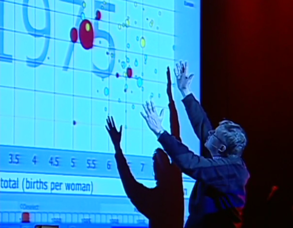
In data visualization the "patter" we use must not confuse. For example, we need to use annotations, title and labels in order to tell people where to focus when they view and interact with a dashboard. The titles frame the story we are telling. The reason Hans Rosling is one of the most influential people in data right now is because of the patter he uses to bring his Gapminder charts to life.
Finally, what's my favourite routine of all time? It's by Lennart Green. This routine is the perfect mix of sleights, misdirection and patter. If you are interested in data visualization, you owe yourself 30 minutes to enjoy this display. It encapsulates everything you shouldn't do in your charts: misdirect, confuse and confound!
