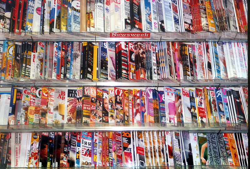
When former Newsweek editor Tina Brown announced in October 2012 that the storied magazine -- for decades a fixture on newsstands and coffee tables across the country -- would end its print edition by the end of the year, she believed the company had done all it could in the realm of print.
Newsweek had been through a rocky few years. Profits steadily declined in the early aughts as subscriptions dwindled; the magazine lost 50 percent of its subscribers between 2007 and 2011. The Washington Post sold the company for $1 to Sidney Harmon, who later merged it with The Daily Beast. It was costing about $42 million simply to print the magazine.
 “In our judgment, we have reached a tipping point at which we can most efficiently and effectively reach our readers in all-digital format,” Brown said in the announcement. “This was not the case just two years ago. It will increasingly be the case in the years ahead.”
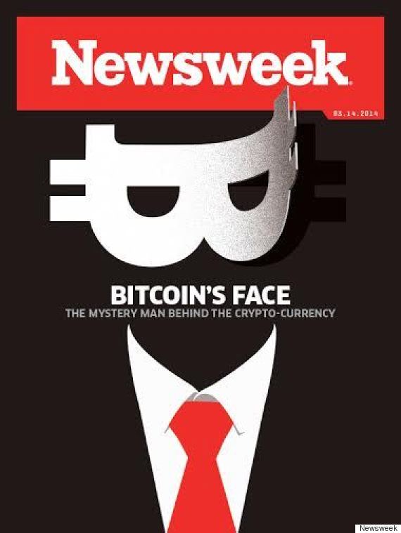
Then something unexpected happened. A year later, IBT Media bought Newsweek, Brown stepped down, and just 14 months after going out of print, the magazine returned, with new editor-in-chief Jim Impoco in charge. Newsweek announced its rebirth with a cover about the elusive founder of bitcoin, depicting a masked figure against a dark background. It caused a media firestorm, with the subject of the profile denying he created the currency and the reporter fervently defending the account. People were talking about Newsweek again.
It turns out the magazine hadn’t done all it could. In the ethereal world of digital media, printed magazines continue to offer something concrete, a tangible representation of a collaboration between editors, artists, designers and writers. And nothing embodies this collaboration like the magazine cover, which remains one of the modern age’s most widely consumed pieces of public art.
As Time magazine's design director, D.W. Pine, put it, “I still feel like the power of the Time cover is because we print it. The power is that we take the time and energy to craft the image, and you have something to hold in your hands.”
New Yorker art editor Françoise Mouly's office sits on the 38th floor of One World Trade Center, where Condé Nast moved its headquarters at the beginning of this year. The north-facing office offers sweeping views of lower Tribeca and SoHo, framed by the Empire State and Chrysler Buildings. On a bright day in March, Mouly glances over sketches on her desk as light pours in from the floor-to-ceiling windows. The Paris native has a delicate French accent, a soft voice just loud enough for my recorder to pick up. Her office walls are draped with cover art, from iconic covers like "View of the World from 9th Avenue" to sketches that never made it to print.

One cover beside the window stands out: two dark towers silhouetted against a black background, indistinguishable from the surrounding space until further inspection. The September 11 cover, published two weeks after the attacks, is one Mouly didn't want to do at first.
“It felt obscene to even have to think about a magazine cover at that time,” she said, gazing out the window. “I felt powerless. My world was upside down.”
So Mouly went with what she calls “a non-cover,” which became one of The New Yorker’s most famous images.
“It was a way to actually make an image and incorporate a negation of making an image -- to say that images are both powerless but also have this infinite power,” she added. “If they can actually encompass their own negation, that’s pretty powerful.”
The Sept. 11 cover serves as proof of the enduring power of the magazine cover. At its best, a cover has the ability to capture a moment in time, but also transcend that moment. It is both timely and timeless, news and art that weighs on our emotions long after the magazine stand is restocked.
“The magazine can pile up by the side of your bed and not become obsolete,” Mouly said, recalling the many people she knows who decorate their homes with New Yorker covers. “They do function as a record of the past. We have a phenomenal record of the past 90 years.”
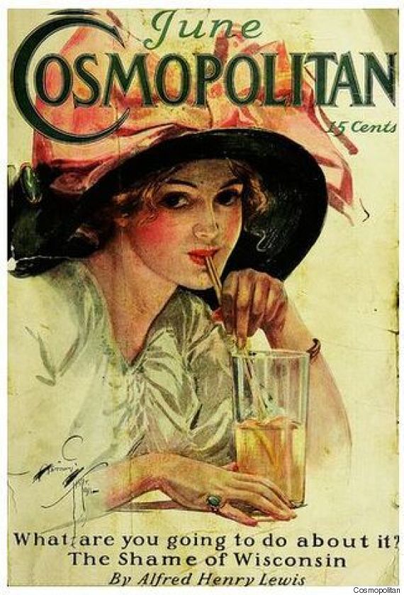 The heyday of the magazine came in the early 20th century, when mega-publisher William Randolph Hearst launched Harper’s Bazaar, Good Housekeeping and National Geographic. Female-targeted Vogue and Vanity Fair followed, bringing fashion and women’s issues to the forefront of popular culture. Time was founded in 1923. The ’30s brought about aspirational magazines like Esquire and Fortune. Widely popular, topical publications directed at niche audiences rolled out in the ’40s and ’50s, including Sports Illustrated and Rolling Stone. The ’60s and ’70s gave us the celebrity- and entertainment-focused magazines People and Cosmopolitan. In the following decades, magazines diversified, with The Face debuting in 1980, Entertainment Weekly in 1990, Wired in 1993.
The late 1990s and 2000s brought about the digital revolution. But while newspapers have suffered steep declines amid the ride of the Internet, magazines are another story. Across the industry, subscriptions are down, but the picture is more complicated than the overarching numbers suggest. Magazines aren’t dying. About 190 new titles launched in 2014, up from 185 in 2013, according to database MediaFinder. While some legacy publications are struggling to keep their readers, magazines like Glamour, Parents and Better Homes and Gardens all reported increases in paid and verified circulation from 2013 to 2014.
This is not to say, however, that the rise of the digital sphere has had no effect on magazines. But it has not supplanted the printed word. In fact, it has breathed new life into magazines’ unique marriage of imagery and words. Digital isn’t killing the cover; it’s saving it -- albeit not in the way many industry-watchers envisioned.
The introduction of tablets and ereaders was supposed to "revive the industry." "Apple's Tablet Could Be Print Industry's Lifeboat," Wired wrote in 2009. But the tablet didn't replace the magazine. In fact, nearly 30 percent of Americans said they have never read a magazine on an electronic device, according to a HuffPost/YouGov survey conducted in March.
“The tablet magazine has been flawed from the start,” vice president of tablet app software company ScrollMotion Joe Zeff told Digiday in a 2014 feature on the device’s flop. “We had the opportunity to put magazines on computers, which should have made magazines smarter. And that hasn’t really happened.”
The problem was that in order for magazines to work on digital devices, the publications had to completely redesign their magazine for that platform. They needed to invest significant time, money and resources into creating a new kind of product tailored to the tablet -- to make it a new and original experience for the reader. Instead, they just reproduced the print product in what you might describe as a glorified PDF.
Part of the problem was technological. “On the magazine creation side, the tools we started with in 2010 haven't really improved that much, so it's still onerous to make digital editions, and that's regrettable,” Wired Editor-in-Chief Scott Dadich said. But tablet magazines simply failed to replicate the experience of browsing through covers on a newsstand. “The actual digital newsstand environments are not really conducive to leisurely discovery,” he added.
Publishers have gotten smarter as the Internet has taken a social turn. With the rise of social networks like Facebook, Twitter, Instagram and Snapchat, editors have learned to design with the magazine’s digital life in mind. Rather than replicating the print cover, they are investing resources in designing for digital platforms -- and bringing readers inside the process.
In the digital age, the magazine cover has become a separate entity, no longer necessarily attached to the rest of the magazine. Digital did for the magazine cover what it did for articles -- it gave them a life of their own. Many readers, for instance, will encounter a cover on Facebook, Instagram or Twitter long before they see it in print, extending its reach with every “like” and share. Indeed, cover images are getting into the hands of readers faster than ever before. While digital media seems to be making the newspaper “front page” less and less important, the opposite is true of the magazine cover.
“The notion that newspapers have to stop obsessing about the front page is pretty widespread now,” Impoco said. “In contrast, magazine covers have become even more important, more focused and more powerful because it’s the story.”
Time’s Pine said he will always love the feel of print the most, but admitted the majority of people who interact with the magazine now do so on digital platforms. That’s why the magazine has two separate design staffs, one for print and one for digital. The print cover is finalized on a Wednesday, and the digital staff then only has a few hours to recreate the cover for the iPhone and iPad editions.
Thanks to social media, the design process is less of a mystery.
The New Yorker is just one publication experimenting with bringing the reader “behind the scenes.” The magazine has a Snapchat account it uses to give an inside look at how the cover was made. Mouly and her team typically talk about the inspiration behind the art and the steps that led to the final product.
Bloomberg Businessweek is doing it as well. In 2013, it launched a series called “Cover Trail” in both digital and print, a guest pass into the cover-making process. The series brings readers into the design room, giving them an open, often funny look at how each cover is made:
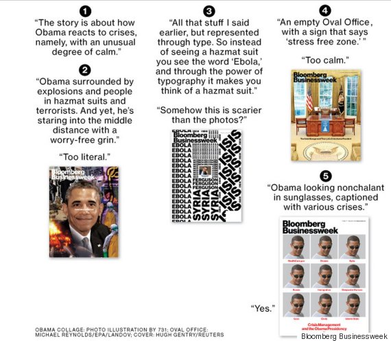
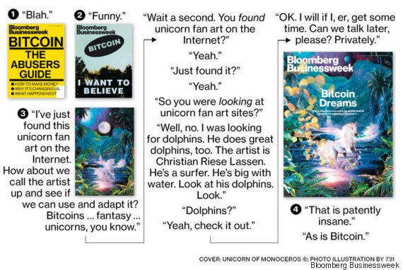
 So if it’s a question of can the magazine cover exist in the digital sphere, The New Yorker’s Mouly puts it best.
“Not only do I think it can," she said, "I think it’s mandatory."
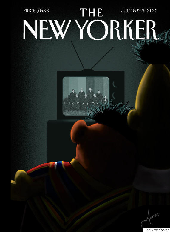
She brought up the now-famous Bert and Ernie cover artist Jack Hunter designed for the Supreme Court decision on same-sex marriage. Online, the cover got more than 600 million impressions across the world, Mouly said. By comparison, The New Yorker’s total print circulation is just over 1 million.
The Internet allows magazines to be distributed farther than ever before. And unlike in print, it doesn’t just stop at your doorstep and build up beside your bed. With its own URL, tweets and retweets, sharing on Facebook -- the cover keeps going. And going.
In other words, the Internet is giving magazine covers something they never had before: the ability to go viral.
“The cover is a statement on so many levels, maybe more now than ever before,” New York Magazine’s Jared Hohlt said. “The cover becomes what people associate with that event.”
In January, Newsweek released what became one of its most controversial covers to date: "What Silicon Valley Thinks of Women," an exploration of sexism in the tech industry. The cover showed a faceless woman who has a large black cursor lifting her short dress.
![]() The cover was lambasted for being sexist and garnered more attention than the article itself.
The cover was lambasted for being sexist and garnered more attention than the article itself.
In a segment on NBC's “Today,” the four co-hosts talked about the controversial cover, but it became apparent that none of them had actually read the story.
“A lot of people say that the actual article is extremely well-written,” Matt Lauer joked.
“I can't wait to read it,” Tamron Hall later added.
Impoco called the “Today” coverage “one of the highlights” of his career.
“That unbelievable viral reaction was 80 percent inspired by the cover image,” he said. “People had such a visceral response to it.”
It was the perfect illustration of the magazine cover’s newfound independence. Whereas the cover used to represent -- and was inextricably linked to -- the story it teased, today the cover is often all we see. Whether tweeted out or posted on Instagram, cover images are standalone pieces of culture that often become more known than the underlying story.
So where is the magazine cover going next? What is the future?
Wired is experimenting with different methods of replicating the cover experience in a digital format. One thing Wired editors are trying is publishing a daily -- or even hourly -- “cover” on its homepage. Dadich called it “a visual wallpaper.”
Other magazines, like The New Yorker and Time, are experimenting with publishing different covers in print and online.
 The New Yorker, for instance, experimented with its first GIF cover in October, which depicted a taxi in the rain with drops cascading across the screen. Mouly said she hopes that after seeing the digital cover, readers will look at the print cover with fresh eyes. In March, the magazine created a cover featuring a fully animated origami rose by Christoph Neimann.
As iPods forced designers to reimagine album art, apps and the Internet have changed the definition of a great magazine cover.
“iPods reduced the size of the canvas and designers responded with simpler, more graphic creations,” Wired’s Dadich said. “The best contemporary magazine covers do the same thing. They have to look as good on an Instagram post as they do on your local newsstand.”
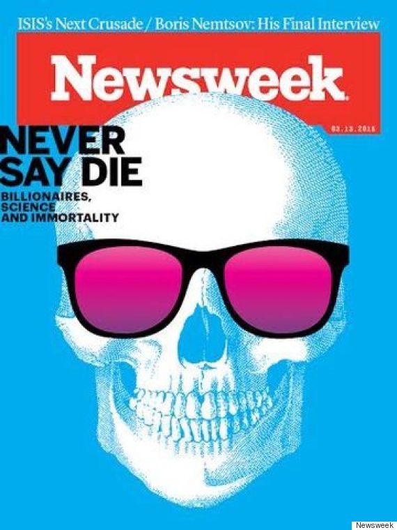
In March, Newsweek celebrated the one-year anniversary of its return to print. The cover, a picture of a skull beside the words “NEVER SAY DIE,” is fitting. The magazine cover is not dead -- it is only growing more relevant, more necessary, more understood.
“There is something pretty persistent about the marriage of imagery and words and timing,” Bloomberg Businessweek's editor Josh Tyrangiel said. “That is a great recipe. It has been a great recipe for centuries now, and I think it will be for centuries to come.”
 Time magazine’s Pine, who has been doing his job for decades, says he still has just one goal after all these years: to take what's going on in the world and “crystalize” it for people inside of a red border.
At Time and across the magazine industry, the borders may have changed, but the commitment is still the same.
The HuffPost/YouGov poll consisted of 1,000 completed interviews conducted March 19-23 among U.S. adults using a sample selected from YouGov's opt-in online panel to match the demographics and other characteristics of the adult U.S. population.
The Huffington Post has teamed up with YouGov to conduct daily opinion polls. You can learn more about this project and take part in YouGov's nationally representative opinion polling. Data from all HuffPost/YouGov polls can be found here. More details on the poll's methodology are available here.
Most surveys report a margin of error that represents some, but not all, potential survey errors. YouGov's reports include a model-based margin of error, which rests on a specific set of statistical assumptions about the selected sample, rather than the standard methodology for random probability sampling. If these assumptions are wrong, the model-based margin of error may also be inaccurate. Click here for a more detailed explanation of the model-based margin of error.

Catherine Taibi is deputy media editor at The Huffington Post.