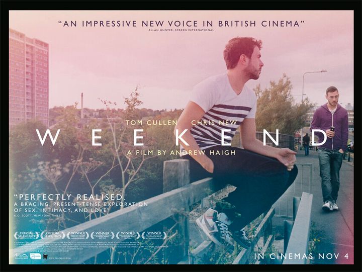
You probably haven't heard of London-based graphic designer Sam Ashby, but the chances are you've seen his work. He designed the film posters for art-house favourites like Archipelago, A Prophet and Weekend, British director Andrew Haigh's acclaimed gay romance. A keen cinephile, he launched Little Joe -- "a magazine about queers and cinema mostly" - in 2010.
How did you become a designer?
My father is an architect, so I think I spent a long time running away from design because I didn't want to follow in his footsteps. After university I eventually tried to get into film production and became a runner at Empire Design. I got very interested in the poster side and it turned out I was quite good.
What was your first poster design?
It was for Breakfast on Pluto [Neil Jordan's 2005 comedy drama]. I'm not even sure whether they ever sent it to the film company, but I think it got some good comments. Then when I moved to AllCity, the one that really sticks in my mind is Anton Corbijn's Control, which was probably my biggest poster for a while.
Do designers usually just rely on looking at trailers and stills?
I always see the films. I'm trying to distil an entire film into one image. But I don't know about others. Book jacket designers don't always read the books!
For Weekend the posters grew out of the work of photographers Quinnford & Scout. How did you get involved?
I'm a friend of the director, Andrew Haigh. We did three versions of the poster for the 2011 South by Southwest (SXSW) Festival release, all based heavily on the photographs by Quinnford & Scout. Andrew was very inspired by their work and tried to carry it over into the production design and cinematography. I don't know how much my work was tied up with the film's early success, but I remember Andrew saying people were asking to buy the posters. For the UK release by Peccadillo Pictures we went for a different approach that tells more of a story. I'm much happier with original posters.
How frustrating is it to see your lovely designs smothered by poster quotes?
It's something I get very angry about. With Weekend, in particular, I had real wrestling match with them over quotes. I felt I had a beautiful balanced composition and then they wanted to throw loads of quotes at it. Sometimes I have to tell myself you're in advertising, you're not an artist!
Is it more challenging to design for independent releases than mainstream movies?
Well the Twilight campaign would be challenging for my Photoshop skills! Unfortunately, with smaller films still struggling, the marketing people seem to be taking a lead from mainstream cinema and trying to appeal to as many people as possible. It makes my job quite frustrating to see that nice ideas still get watered down even within the art-house market.
What about the impact of digital technology - do you ever use a pencil?
Yes, often I'll sketch drawings that look similar to my final concept. I like to have one stage in the "real" world -- it helps develop the composition. I don't think digital has made people lazy, though. If anything, it's had a democratising effect -- there are just so many different areas you can design for now.
The internet caters for all cinematic tastes, so why launch Little Joe as a limited edition film magazine?
That's a very good question. I design for print essentially. I'm not interested in designing for online. When it came to my own project it was always going to be a physical object. I'd always wanted to do a magazine, so it was just a question of what it would be about.
Did you read a lot of magazines when you were growing up?
Although I grew up at same time as the Internet, I was completely obsessed with magazines. I would pull out whole pages and create wallpaper for my room. My bathroom wall is still plastered with images from The Face.
Is there a theme for Issue 3 of Little Joe?
The whole issue is bookended by loss, because [cover star] George Kuchar died in September, and then Ken Russell died just as we were going to press. I've also written for this one for the first time. I did interviews with [Tomboy director] Céline Sciamma and with Andrew Haigh. I also wrote an essay on Derek Jarman's sets for The Devils.
How do you see the magazine developing?
This is a labour of love and seeing how people have responded has been incredible. The fact that we've doubled our print run each time proves that there is a need for it. Next year we're also doing a monthly screening programme at the Rio Cinema in Dalston and the Cinema Museum in Kennington.
Who's on your "wish list" of future contributors?
I'd love to get Todd Haynes and Tilda Swinton. I'd also like to talk to Madonna about all her strange film choices!
Weekend will be released on DVD by Peccadillo Pictures on 5 March 2012.
Little Joe No. 3 is out now and is available from www.littlejoemagazine.com
You can read more about Sam Ashby at Sound on Sight

