This month, The Big Issue celebrated reaching its 21st year on British high streets.
Since its launch in 1991, the magazine has been challenging perceptions about homelessness and empowering homeless people to find a route out of poverty.
At the same time, it's managed to carve a place in the British media as a dynamic publication in its own right, regularly landing exclusives and, perhaps more impressively, surviving when so many other magazines have fallen by the wayside.

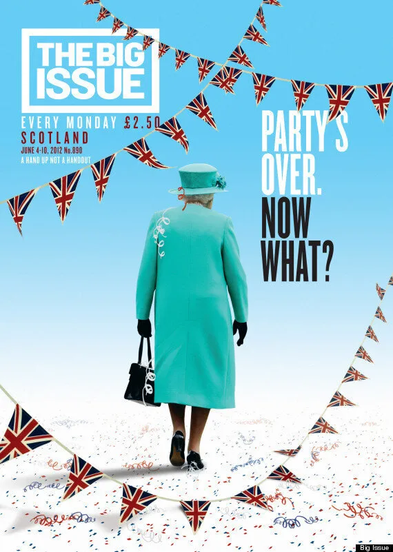
June 2012's post-Jubilee cover
The celebrate their birthday, we asked editor Paul McNamee to select his ten favourite covers from the past two decades and talk to us about the unique challenges of designing a magazine to sell on the street.
"I wanted us to be a poster as much as a magazine front-cover," McNamee explains when discussing their recent redesign.
"It's tough [for The Big Issue] to attract attention on the street. We have to attract for purchase immediately because our readers don't browse - people won't stop and chat to a vendor as they turn through a few pages."
This has meant ditching multiple headlines and pictures and generally sticking with one bold element, unlike most magazines which generally use their covers to advertise lots of what's inside.
"We have to look demonstrably different week on week so people at distance know they haven't got that one, but at the same time, have an identifiable element to what we do.
"There needs to be a playfulness, an irreverence and a certain fearlessness to all our covers."
Here are McNamee picks for the Big Issues that worked best.
