From one perspective, the Samsung Galaxy S4 is an unimpeachably brilliant device.
It has a wonderful five-inch 441dpi screen, a ridiculously powerful processor and decent battery life. It's light, thin, smooth and intuitive to use. It runs the latest version of Google's increasingly wonderful Android OS, has an excellent 13-megapixels camera, is full of interesting new features and is capable of a few 'oh wow' software moments.
And yet the S4 is also way off the 'naturally perfect' ultraphone that Samsung says that it built. It feels cheap, its unique software features are half-baked, and there is nothing in either hardware or software that sets it clearly apart from the competition. It's not just imperfect through a lack of features, or boring through a plateauing mobile industry: it's actively awkward because of the choices Samsung made.
Take the new headline 'Smart' features. Smart Stay knows when you're looking at the screen and keeps the phone on until you look away. Smart Pause does the same for videos - pausing when you look up - and Smart Scroll watches your face to know when to move a page up and down. Meanwhile Air View and Air Gesture make it possible to control elements of the OS without touching the screen, such as an overlay of alerts and other information.
All of which is great - and, when it's working in front of your co-workers or friends, outstandingly impressive. The problem is that the software can't quite deliver in real life. Smart Scroll, for instance, only works only in certain apps and often has problems picking up your eye position at all. Outside, in low light or when moving, it fails more often than not. When it struggles, it pops a little blinking eye up on the screen and refuses to give up, which is distracting and annoying. Likewise, Air Gesture is an oblique feature and doesn't work as you'd anticipate. Hovering over titles in Flipboard brings up information automatically, for instance, but doing the same on the homescreen does nothing.
Most reviews have noted this problem, and argue that these are 'pro level' features not aimed at the general user. But that's just not good enough when it comes to the S4. These apps aren't awkward because users are stupid - they're awkward because they're designed that way.
READ MORE: Samsung Galaxy S4 Reviews Round-Up
Similarly, the design problems with the hardware - that it's 'slippery' to hold, is still made of cheap-feeling plastic (even the bits that look metal) and 'vibrates' oddly when you tap it or set it down on a table, are a result of concious choices on Samsung's part. In some ways it makes devices like the iPhone 5 feel heavy and old-fashioned. But where the iPhone feels like it was carved from a solid meteorite, the S4 requires that you pop the back off to put in your SIM, SD card and replaceable battery and see, with your own eyes, that it's just a load of parts in a case. That's fine - even preferable for many. But is it really the best that Samsung can do?

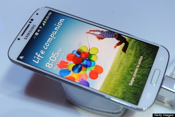
If you want to know if you should buy the S4 you should just look above, at the default lockscreen. For it is unfeasibly strange.
The wallpaper is a badly cropped picture of a child clutching a bunch of balloons, which looks like those stock images you used to find in Woolworth's photo frames. Above it, in a font reminiscent of Comic Sans, is the meaningless phrase 'Life companion' - with the first word uppercase, the second word not. And when you swipe across the picture you make a trail of fairy dust appear.
Now, to some people this is fine - an expected oddity of stock OS design which can easily be changed and adapted. For others, it doesn't matter - they'll never notice, and probably never change it. If you fall into those camps? Buy this phone. Everything else about it is brilliant. You will not regret it. It does enough to earn its five stars.
But for those whom this lockscreen gives pause, reflect on it a while. For rattling around in its depths, somewhere, is the the central conundrum of the S4, still unsolved.
Samsung's challenge here was not just to make an excellent phone - which it did, unquestionably. It was to take its S3 momentum, and from that construct the most beautiful, elegant and masterful mobile phone experience on the planet.
So when you get the S4 turn it on for the first time, and stare at the lock screen.
Did they do it?
Did they?
HuffPost Rating: 9/10
