Apple's plans for wearable computers remain under wraps - and possibly nothing more than theoretical, even inside the company.
But out here in the fields of the internet, the concept is getting more real - or at least more convincing - all the time.
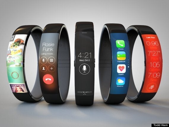
The latest independent attempt to realise a workable, realistic iWatch comes from Todd Ham, who developed an earlier Nike Fuelband-iWatch Hybrid with a new, vertical interface.
Ham's iWatch is simple in the extreme, with a simple curved touchscreen on the front and a single home button on the left.

He explains that he tested his new idea by thinking through how you might actually call someone - a task which is easier said than done on most current-gen smartwatches:
"In the animation you can see how the Phone app could potentially work. One of the challenges I ran into was what to do about tabs. A normal tab view across the bottom wasn’t going to work so I came up with a simple drop down control in the title bar. Tapping this would display a popover menu showing the other available pages. I also purposely left out several of the controls like “Edit” and “Add Contact.” On a device this small I think it makes more sense to manage apps, contacts, and media from a synced iPhone or Mac."
Take a look at how it works over at Ham's website, or watch the video above for more details.