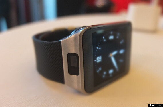
Before we actually got hold of one, the original Galaxy Gear seemed bold and ambitious. In person that fell apart. The device was actually quite bulky, with only a day’s battery life and serious missing features including workable Gmail and Facebook notifications. It was also a bit drab and dark, with a virtually monochrome interface and a strange camera-equipped, non-removable strap.
All of these problems and more have been addressed in the rapidly unveiled Gear 2 and Gear 2 Neo (the Neo is made of plastic, compared to the Gear’s metal construction, and lacks the camera, but other than that they are the same device).
The result is not quite a slam dunk - it remains to be seen whether the ‘watch’ form factor is really where wearables are heading - but it’s a really impressive and welcome evolution. It makes sense, and it’s cooler than ever. That’s a win for Samsung.

READ MORE:
In person the new watches are most obviously far more attractive than the older versions. They are both much thinner and sleeker, are lighter and sit more easily against the wrist. The new and more colourful interface (this time based on Tizen OS not Android, though you’d be hard-pressed to notice unless you’re an expert) makes the watch feel brighter and more alive, and lets the decently specced screen come to life more than it did in the previous generation. And the addition of swappable straps - including a leather strap option - will make a big difference for many potential buyers, especially at the high end.
There is also a lot more functionality included this time around. New features include a heart-rate monitor, which appeared to work fine in our limited test, and which is mounted on the rear of the watch but has to be manually called up with an app, new fitness tracking software, a built-in media player (which works with Bluetooth headsets and 4GB of on-board storage), new apps from the likes of Strava and Runkeeper (for fitness), PayPal for payments, CNN for news and more. (Samsung also promises new apps through the Gear 2’s life time, though we’ve heard that before…)
The overall impression is of a very solid and impressive upgrade - both the Neo and the Gear are much more attractive than the original. What remains to be seen is whether it’s enough to convince consumers that they need a smartwatch in their life - especially against Samsung’s own Gear Fit, with its cool curved screen and sleeker profile. The Gear needed an upgrade, but it was the concept itself that hasn’t quite convinced the world it needs to exist. We suspect Samsung will have to keep making that argument with future iterations.