The Moto 360 has been the poster boy for Android Wear and the rise of smart watches in general. Well now it's finally here with a UK release date of early October and price of £199.99.
We were lucky enough to get a short time with Motorola's pride and joy and here are our first impressions.
Key Features:
- 1.5-inch 320x290 circular display
- Corning Gorilla Glass 3
- All-Day battery life
- Android Wear
- 4GB storage
- Optical heart rate monitor
- Wireless charging
- Water-resistant
Verdict:
Well this has been a long time coming hasn't it. Remembering the first time we saw the Moto 360 it became clear that smart watches were here to stay and leading the charge would -- of all people -- be Motorola.
Considering its biggest product at the time was one of the cheapest phones you could buy (the excellent Moto G), it was with some skepticism that we approached the Moto 360, it almost seemed too good to be true.
Picking it up for the first time and it immediately becomes clear that the Moto 360 -- along with the new Moto X -- are a turning point for Motorola.
The Moto G was never poorly made, in fact the build quality was excellent, but it could never use premium materials due to the cost.
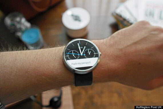
The Moto 360 throws this ethos in the bin. With a smooth brushed metal body and high-quality leather strap it looks stunning, both in black and silver.
It's lighter than you expect at only 49g, and thinner too at just 11mm. Some of the early pictures raised some concerns about how 'chunky' it might look. Well the good news is that it's much smaller than you think it's going to be.
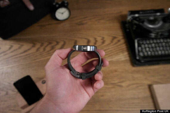
On the back of the watch there's an optical heart rate monitor and on the side a single lock button that's also made out of aluminium.
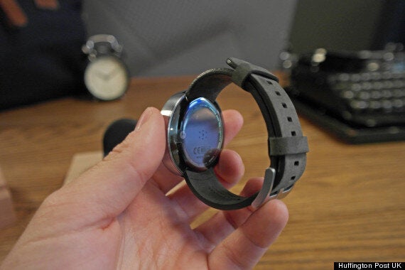
To say that it's as well built as any premium watch is no understatement and it's certainly the first smart watch that we'd consider wearing out in the evening as well as during the day.
You wake the screen by either raising your hand, pressing the lock button or just pressing and holding on the screen. Once woken you get full view of the 1.5-inch LCD display.
It's a bright display and while nowhere near pixel-less it's a high-enough resolution that you won't notice. It was difficult to tell how the screen would perform in bright sunlight so you'll have to wait for the full review. For now though everything is present and correct.
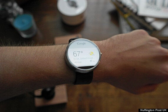
The Moto 360 comes running Google's Android Wear interface along with a selection of watch faces provided by Motorola.
Android Wear is pretty much out in the open by now and it's ultimately the same experience no matter what smart watch you have.
Commands are given via Google Now while interactive tiles show you notifications and relevant information on your location and time of day.
They look great on the Moto 360, especially with that curved display however we are starting to feel that maybe Android Wear is nothing more than a wearable version of 'Google Now'.
Motorola claims that the Moto 360 comes with a full day of battery life, while that's not as much as say the LG G Watch, Motorola has made sure that charging isn't a hassle.
The Moto 360 comes with a wireless charging dock - indeed it's the only way you can charge the Moto 360. The dock is simple, study and designed for desks and bedside tables.
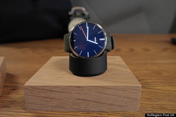
So what do we think? Well in terms of hardware the Moto 360 is as good as you hoped. It's beautifully built and it's a concept that has been realised with absolute precision.
Any reservations lie solely with Android Wear, not the hardware. It's a great, intuitive operating system and while it's certainly smart this is definitely just a starting block and that as Google updates and refines it, it'll become smarter and smarter.
For now though, the news is good. Check back for our full review in a few weeks time.