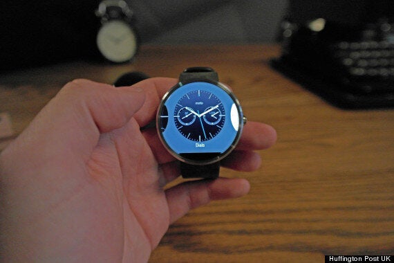
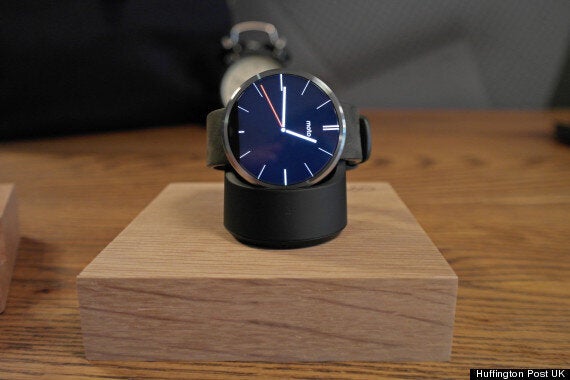
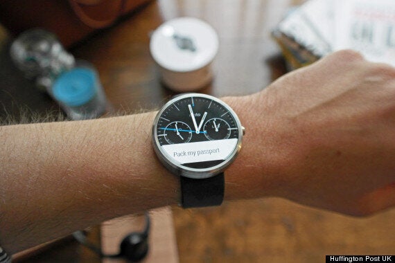
The Motorola Moto 360 starts at £199 and is available from early October.
Key Features:
- 1.56” 320 x 290 LCD Display
- Android Wear
- Waterproof
- Wireless charging
- Optical heart-rate monitor
The Pitch:
"Moto 360 is a classically-designed, modern timepiece powered by Android Wear. Comfortable, familiar, and crafted with the finest materials, Moto 360 keeps you up to date without taking you away from the moment."

The Verdict:
As a technology journalist we usually see new products twice. The first time is a "preview". It's where all those 'hands-on' 'reviews' come from and it involves spending anything from 10 minutes to an hour with a product. It's usually pre-launch and it's a great way to nail down some impressions on certain aspects of the product.
The Moto 360 has been in 'hands-on' mode for about six months, and all that time it's been the hardware itself - how it looks and feels to wear - which has generated so much momentum. However as more and more reviews of Android Wear have emerged on other smartwatches, it has become clear that although innovative, the software is neither the future, nor the futuristic hands-on experience we want right now.
So it was with a certain amount of trepidation then that we went 'hands-on' with the Moto 360. As you can read in our Moto 360 Preview, the smart watch lived up to many of our initial preconceptions.
But now, after nearly a week of using the watch, it is clear that while it has the looks, the Moto 360 is missing... well, almost everything else.
When you first take it out of the box it's hard not to marvel at the build-quality. Motorola really has kicked it out of the park with the Moto 360, it's a stunning-looking piece of technology.
The all-metal body and Gorilla Glass 3 screen mean that it looks as good as many a high-end timepiece, the leather strap fits perfectly too. Some might argue it's too big but even for our tiny wrists it didn't feel any worse than simply wearing a thicker watch.
As well as the watch you also get a wireless charging dock which can sit either by your desk or by your bed.

Boot Android Wear up for the first time and as we've found with the LG G Watch the startup process is beautifully simple. Install Android Wear on your smartphone and you're good to go. The Motorola Connect app adds an extra level of customisation by letting you change the colours of the watch faces.
It's from this point that the dream starts to crumble.
For starters the Moto 360 is underpowered. You may (or may not) have heard that it comes with an old processor, inherently we wouldn't have a problem with that as long as they'd made sure it didn't impact the experience.
Unfortunately it does, we found that everyday usage was pretty laggy. Whether it was swiping away notifications or scrolling through conversations the 360 felt like it was stuttering.
This combined with the relatively low resolution screen means that the experience on the screen jars with the product that's surrounding it.
There's also the small matter of Android Wear itself, and whether - post-startup - it's good enough, frankly. We're not the first to question it, and we're certainly not going to launch into some long rhetoric about how it's not fully there yet.
The plain fact is that at the moment it's not a scaleable product, or at least Motorola hasn't scaled it well for the Moto 360.

On the Moto 360, text is massive, as are the notifications. They take up the screen and feel clunky to interact with - which is ironic really as Android Wear was made to be simple.
We never thought we'd say this, but in terms of notifications, we actually prefer Samsung's way of doing things. On the Gear 2 it's subtle and discrete, on the Moto 360 it feels as rude to check your watch in company as it does to check your phone.
It's frustrating. Aside from the processor and screen Motorola has nailed the hardware, it's stunningly well-built and no we don't think it's too big. The wireless charging is a must because until they progress battery technology we're all just going to have to accept it'll need charging once a night.
We almost wish Motorola had ditched Android Wear and come up with something more bespoke. Maybe in a year manufacturers will have had long enough with Android Wear to start customising it, tailoring it to each watch.
For now you have a beautiful but flawed attempt at a smart watch. In the context of smart watches, this is the best available at the moment, but only just, and at £199 you would be wise to seriously think about waiting for the second-generation.
We're nearly there. But we're not there yet.
