The map of the London Underground is an iconic design, almost as beloved to some as the network itself.
Based on a 1933 template by electrical draughtsman Harry Beck, it has has largely stuck to its formula of classic straight lines and sharp angles.
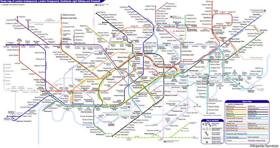
But it has had an unofficial revamp – introducing curves to denote the Circle Line, walking interchanges and even future lines that aren’t in use yet.

Click here to see the map in all its glory
Hong Kong-based Wikipedia user Sameboat came up with the revised map, which includes Crossrail, the future Battersea extension of the Northern Line and the Watford branch on the Metropolitan Line.
The map was spotted by CityMetric, which points out just how superior it is to the latest zoomable version as released officially by Transport for London. [Which it scathingly describes as: ‘It’s cramped, it’s unclear, and it just isn’t very pretty.’]
SEE ALSO:
- Cherry, Wet Chalk & Monkey Nuts: This Is What London Underground Stations Taste Like
- Animals On The Underground: From The Wapping Whale To The Hammersmith Pig
- At Last! London Is Getting A 24-Hour Tube Service And Here's The Map
- Beat The Tube Strike With This Fantastic London Underground Walking Map #WalkLondon
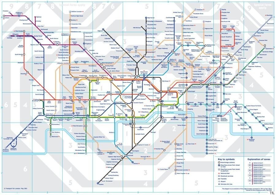
The official map was released earlier this year and features 28 new London Overground stations taken over from National Rail services – thus populating it with a whole lot of extra orange...

The London Underground updated its official map in May. Click to enlarge
[CityMetric also points out that the new map corrects this by differentiating the lines, though does ponder on the given names – ‘The old East London line is now the South Chord?’]
On the official map the Liverpool Street - Shenfield line is also prominent as TfL Rail takes it over from Abellio Greater Anglia (until it becomes part of Crossrail in 2018).

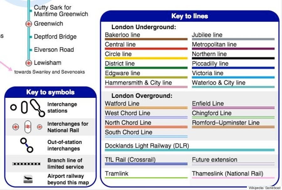
The key to Sameboat's unofficial map
Another difference in the new map was the appearance of a kink in the Central line - there to make way for the addition of Crossrail in three years.
The thinner font drew criticism as did early online incarnations of the design, which bizarrely saw a few lines disappear completely.

Teething troubles: There were some glitches in early incarnations of the new official map
The Emirates Air Line in Greenwich mysteriously fell off the map, leaving a random floating cable car on the bank of the Thames and the rarely understood District Line service from Earl's Court to Kensington Olympia also temporarily vanished.
Sameboat’s map has been online since August and appears to be a work in progress with new versions being uploaded since.
Something he/ she might want to address, however is the wheelchair accessibility of stations...