Google has a new logo, and here it is.
Designed to retain the friendly approachable style of the old logo while introducing a more modern and clean look the logo certainly ticks all the boxes.
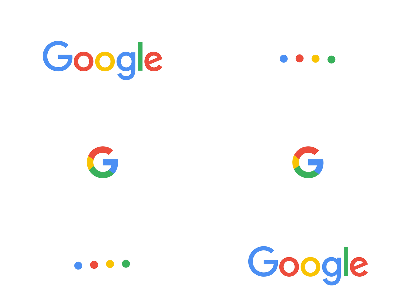
It'll appear in three different forms across all of Google's products ranging from Android, to Chrome.
There's the classic Google, the four dots that'll be used for voice control and then finally the G which will appear in all its shortened forms.

If you fancy reading more about how Google came up with its new design there's a rather handy blog post which goes into eye-watering detail as to what prompted the design change.
While on the surface it might seem to be nothing more than a simple switchover to keep the logo in line with its new parent company Alphabet there are another of actually quite interesting reasons.
The first of which is data consumption. Turns out that Google's old logo wasn't very good for data consumption on low-bandwidth devices.
This new logo uses far less data to load so when you're Googling something it's only the answers that are going to be chomping away at your data allowance.