
Logos are interesting things.
There’s the hidden bear in Toblerone’s one, for instance; there’s the interesting history of NBC’s rainbow-hued logo, partly designed to emphasise the beauty of colour TVs, to consider, too.
It turns out NBC isn’t the only Hollywood bigwig with a quietly clever logo, either.
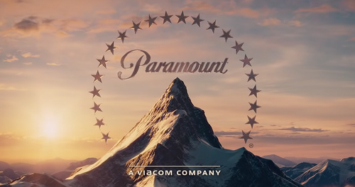
According to TIME’s Populist, there’s a hidden significance to the stars above Paramount’s iconic mountain, too.
Which is?
Well, first we have to talk about the studio’s history.
The company, which was founded in 1912, was known for discovering and signing the biggest stars (hmmm...) of its day.
Marlene Dietrich, Mary Pickford, Douglass Fairbanks, and Gary Cooper were among its early Hollywood heroes.
The mountain itself was allegedly scribbled on a scrap of paper by “the Man Who Invented Hollywood,” W.W. Hodkinson.
This mountain has since changed design, and so have the number of stars (from 24 to 22).
“The original logo had 24 stars (for each of the two dozen actors under contract in 1916),” TIME writes.
Though Paramount says “the meaning behind [the stars] has always been a subject of lore in the industry,” they link out to the same TIME article on their site.
Huh. Why has it changed?
Even if we can’t say for sure the actor theory is true, the company themselves has written that their Paramount+ logo’s constellation hides a sneaky Easter egg.
“The number of stars was reduced to 13 — a star for each letter used when spelling ‘Paramount Plus’,” their site reads.
They also had to be made bigger to be visible on a phone screen (handy that there are fewer of them, then).
It’s not clear why the company shifted from 24 to 22 stars, though.
As the company’s content travels online as well as being shown in cinemas, its site says there need to be different considerations for its logo ― especially as it’s increasingly seen on smaller screens.
That includes not only the stars, but “the detailing on the mountain, or even the spacing between the classic Paramount script” too.
Who knew so much went into the iconic logo?