Congratulations to Germany. They were the best team in the competition and deserved their 1-0 victory in a great final. It was a fantastic winning goal, too, by Götze. After four great weeks, national teams, FIFA and the players will be reflecting on possibly the best ever World Cup. As a data geek, I too am doing the same, but focusing on the implications for data visualization.
I believe data visualization took some great steps forward during the tournament. Below are my thoughts. What about yours? Let me know what your highlights were in the comments.
1.Data provided new and innovative stories
Newspapers and bloggers need to tell stories. I saw more visual storytelling than ever before over the course of this tournament. Not only were the stories interesting and compelling, I also enjoyed seeing plenty of effective charts that also stuck closely to visual best practices. I particularly liked The Economist's World Cup goal profile, showing the time at which every single goal was scored.
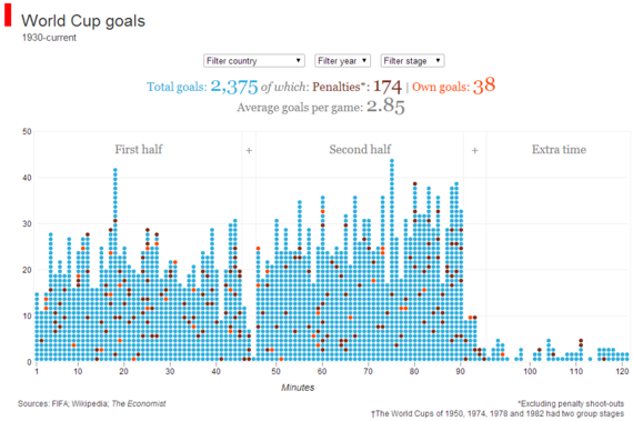
It reveals surprising patterns. For example, how come so many goals get scored in the 18th and 75th minute?
There were many stories that explored visualizations that explored where each squad member plays domestic football. Quartz had a nice example using a simple heat map.
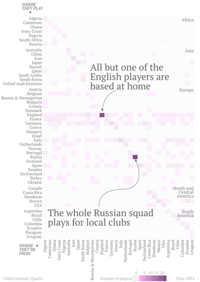
What do these examples allow us to conclude? First: in 2014 there is a bonanza of interesting data available. Second: you don't need complex chart types to tell interesting stories - bar charts and heat maps which can be made in any visualization tool are just fine. And third: some stories are best told with visualisation.
2.Data Visualisation is the new normal
I've never known a lack of ceremony be so important. Visualisation became an unmentioned but vital part of coverage. For example, The Guardian and the BBC began showing live visuals of game stats in their minute-by-minute reports.
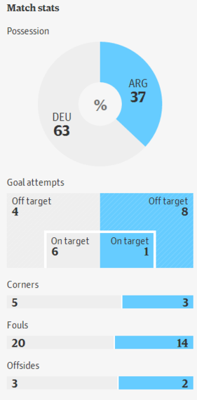
They aren't flashy; they are simple and designed to convey key information quickly. I'm particularly excited that these weren't introduced with big splash articles. The media organisations didn't feel the need to shout about their amazing new visual tools; they just got on with it. This tells me that visualization is becoming a new normal.
3.Interactive World Cup predictors have replaced the wall chart
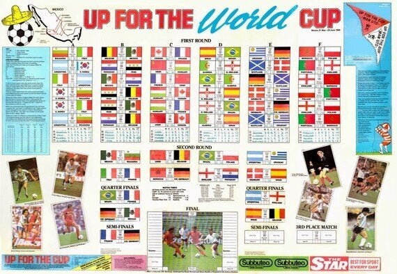
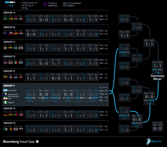
In the 20th century, newspapers would try to produce the best wall charts in order to increase sales. Today they offered interactive predictors with all sorts of crazy designs and statistical models. ESPN tried to Americanise the tournament with an interactive Bracket. The Telegraph did something similar but with little design flair. They were good enough to call it the "Wall Chart predictor game" though. Bloomberg tried something different, making something that was as interactive as it was readable.
4.Social Media visualization comes of age and provides real business value
Social Media exploded in the 2014 world cup. For sheer volume, the World Cup provided the most talked about sports event ever. According to @TwitterData, the conversation during the final peaked at 618,275 tweets per minute.
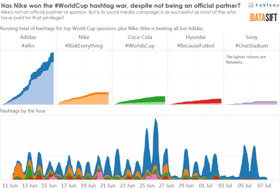
Taking part in this global conversation was fun but it also helped establish the business value of social data married with data visualization. One example was to measure the success of official sponsors' campaigns compared with non-sponsors campaigns. You can measure this in many ways, for example by tweets, uses of hashtags or clicks on links. For example, looking at hashtags, we can see that Nike, not a World Cup sponsor, outperformed all but one of FIFA's official partners. This valuable business insight helps brands and businesses consider how to focus marketing. You can find out more about this story here.
5.It was fun
The World Cup is a festival, a spectacle, a chance to look at the world through any lens. Data visualization allows us to see the world in this way. The amount of data being generated by the World Cup lets us explore anything.
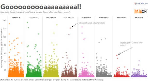
My favourite personal project was inspired by South American commentators and their elongated "gooalll" screams. James Rodriguez provided a stellar example this year. I wondered how this was reflected on social networks. When people celebrate a goal, how many characters do they use in the world "goal" or "gol"? Turns out, it's quite a lot.
Beyond the world of charts and interactives, there were other amazing ideas. #thetimeofthegame asked people to tweet photos of their TV screen, along with location and the time of the game. These were assembled into an incredible animated collage. This takes data visualization directly into the realms of art; it highlights, in ways not possible before, the global nature of sporting events.
Now that FIFA are packing their bags and heading home, I can only imagine what visual delights await us in 2018.
What were your data visualization highlights of the World Cup?
