No, this isn't another dire prediction about the end of the world - but, in 1,000 days, we will arrive at the end of 2015. That's when the world is supposed to reach the endpoints for the Millennium Development Goals (MDGs), the targets set by the global community in 2000 for various improvements in the state of the world's people. Inevitably some of the MDGs will be on target in some parts of the world, while others will not meet the mark. Already the global community is starting to ask what should happen beyond 2015, since clearly there will need to be an on-going development agenda.
This week in Stockholm, Sweden, there will be a public debate on Thursday April 4 (starting at 9 am CET) about what the next steps beyond 2015 might be in terms of global health. You can follow the webcast at www.globalhealthbeyond2015.se and engage via Twitter using the #GH2015 hashtag.
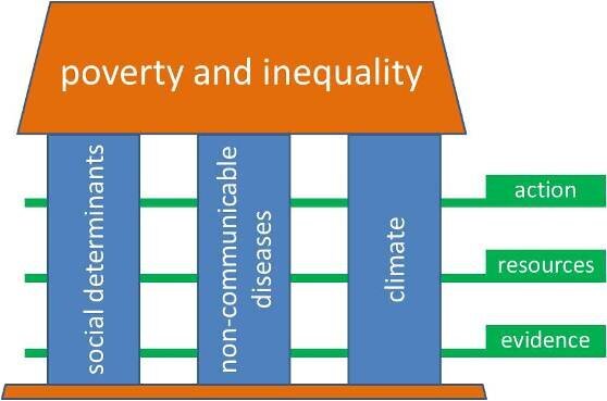
The framework for the discussion looks like this:

Three major areas of concern in global health - the social determinants of health, the consequences of non-communicable diseases (NCDs) and the effects on health of climate change - have been picked, not because they are the only important issues, but since they are likely to impact billions of lives in one way and another in the coming decades. The effects of all these factors are closely linked to the over-arching consequences of poverty and inequality.
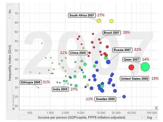
Using Hans Rosling's Gapminder software (which he will use live at the Beyond 2015 event), we've put together some examples of how these factors come together in a few countries:

Although this chart might look a bit complex at first sight, it shows some straightforward messages. As you move from left to right, poverty reduces. As you move from bottom to top, inequality within countries increases - bigger gaps between the rich and the poor inside particular countries. The size of the bubbles that represent particular countries represents the amount of carbon emitted per person, and the red numbers next to the selected countries shows the risk of someone dying from a non-communicable disease (things like heart disease, diabetes, cancers) between their 30th and 70th birthdays - often known as a premature NCD death.
As we wrote in a Global Health Action article introducing the coming debate, not surprisingly, the richer countries (right-hand side) are generally the greater per capita carbon emitters, but they also tend to be less affected by premature NCD mortality. This shows very clearly that premature NCD mortality is not primarily a product of affluence or industrialisation. Inequality (top area) is strongly associated with some of the world's emerging economies, which also carry substantial burdens of premature NCD mortality. Poorer, low-carbon emitting populations, exemplified here by Ethiopia and India, also carry high burdens of premature NCD mortality.
Please join us in Thursday's debate. What are your visions for global health Beyond 2015? What does the world need to be putting on the agenda now to safeguard health in the future?
