No matter how much time you spend watching Netflix every week, the streaming service wants you to watch more.
One way the company is doing this is by spending billions on acquiring and creating the best shows and movies out there. That's great, and offers real cultural value.
Another way Netflix does this is by using extremely complex algorithms and subtle marketing features to trick you into watching more... and more... and more. That's not so great, if you value your free time and don't want to waste your precious hours on this planet watching sub-par shows and movies.
You're almost definitely well aware that Netflix programmes episodes to autostart when the previous episode finishes, thus increasing the chance you get locked into an unintentional binge. That's the kind of obvious product choice that you can spot and avoid if you want to.
But there are a few other tricks the company employs that you might not have noticed yet.
Netflix is also very open about these "tricks". The company documents product rollouts extensively on various company blogs that you can read for yourself.
The Streamline mission is to help you make better and more intentional choices of what to stream, rather than waste your time with mediocre content. Hopefully, becoming aware of these subtle tricks will help you.

1. The customised images

Back in the early days of the Netflix streaming platform, the service would show you the actual promotional posters for the various shows and movies it offered. Later, Netflix decided those recommendations would be better with custom pictures.
This initial customisation decision fixed a couple of problems: Netflix could start using horizontal photos that allow for bigger typeface and design variance. The images could also show character faces more clearly than just hoping the movie posters were good.
There are a lot of bad movie posters out there — or at least, plenty that don't look great as small images on a television, laptop or smartphone screen. So this move by Netflix made sense.
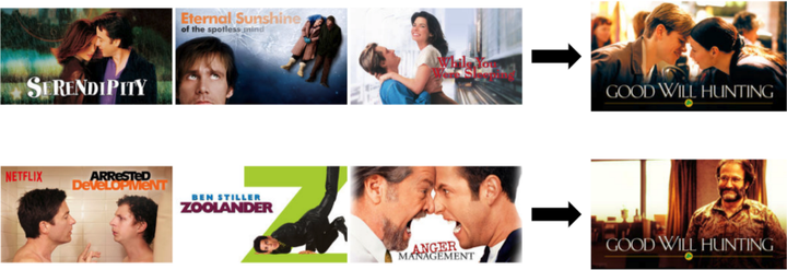
In December 2017, Netflix announced that the customisation would get fancier, by offering different promotional images to users based on that specific user's tastes.
As seen in the example photo above provided in Netflix's announcement, the service will try to make you think a show or movie is just like the other shows and movies you like.
The photo example focuses on variants of comedy fandom. If you're a fan of classic comedies and there's a famous comedian in a particular project, Netflix will show you a picture of that person. If you're more a fan of romantic comedies, then Netflix will show you two characters from the project that might be in love.
For an important Netflix Original rollout like the latest season of "Stranger Things", Netflix made many different custom images to appeal to different users. You can see a few of them in the image at the very top of this article.
On February 7, Netflix announced that the company now uses an algorithm to comb through shows and movies to find the perfect promotional stills, given different marketing requirements.
Basically, this Netflix algorithm will find stills of character close-ups in some sort of emotional moment. And then eventually another Netflix algorithm decides which characters to market to you (such as the famous comedian or the couple from the example before).
Presumably the algorithms will just get more and more powerful, until every show and movie on your homepage looks like something you'd want to check out.
2. The special attention to fonts

This is far from a Netflix-specific trick. Marketing designers have long used font choices to distinguish products from each other.
But given Netflix's extremely large catalogue of original shows and movies, it's worth noting how the company uses font to make everything seem unique.
Back in March, the data visualisation website Venngage explored the connection between Netflix's font choices and user psychology.
The Venngage team essentially pulled a ton of data on Netflix font selections and then showed that Netflix is putting nuanced care into this design element.
Pretty much every Netflix show has its own original font. Even a blockbuster like "Avatar" famously just used the maligned font Papyrus.
Although the use of customised fonts might seem like a small thing, Netflix's special attention here exemplifies that the company is trying to use every advantage it can to get you to click on more content.
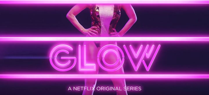
The decorative "Glow" font or the handwritten "Love" font or the mystical "Ozark" font might have been the final push you needed to click on those shows.
3. The algorithms used to customise your rows

Those rows of recommendations on your Netflix homepage are way, way more customised than you probably thought.
And the company is constantly experimenting with what to recommend to you.
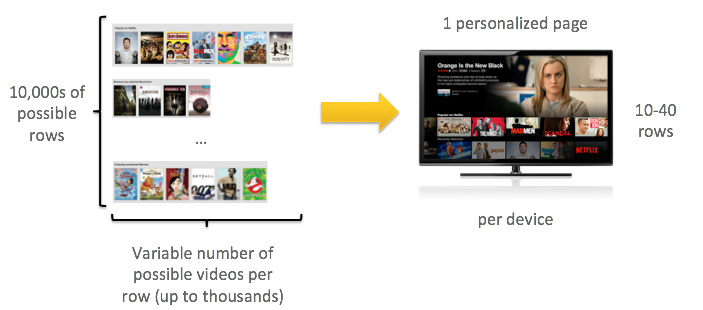
Netflix explained the case for the "rows" concept in 2015. Understanding this technique is a good starting point for comprehending the home page customisation in general.
The Netflix announcement from 2015 described it well, so here's the relevant paragraph:
By presenting coherent groups of videos in a row, providing a meaningful name for each row, and presenting rows in a useful order, members can quickly decide whether a whole set of videos in a row is likely to contain something that they are interested in watching. This allows members to either dive deeper and look for more videos in the theme, or to skip them and look at another row. This would not be the case if, for example, the page contained a large, unorganised collection of relevant videos.
So "rows" are Netflix's organising principle. And as you can guess, customisation can easily be achieved by showing an "action" fan a row of action movies.
As you've probably noticed, Netflix tends to offer genre rows that are far more specific than "action" though. So a user could get a "Cerebral TV Shows" row or "Irreverent Rant Stand-Up Comedy".
(There are even secret codes you can use to find these lists, as pointed out by The Daily Dot.)
But the Netflix customisation gets far more nuanced than even that.
One such way is a process Netflix explained in 2017 as "interleaving".
Basically, this process allows for a more incisive approach to gathering data on what you want to watch. Instead of just gathering the data that you're watching a "Cerebral TV Show", Netflix is running multiple tests within that given row.
This is definitely confusing, so here's an attempt at a simplified example:
While you see one row of content on the home page with one label (such as "Top Picks" for you) the Netflix algorithm has actually hidden various, even more nuanced rows of options in the same row.
Therefore, it seems that multiple subsets of, say, the "Cerebral TV Show" concept are actually in that row you perceive to be just one thing. And then if you consistently choose one particular secret subset, the whole row will shift to give you more from that particular algorithmic recommendation.
Long story short: the algorithm is very far past a simple "user likes action movies, show more action movies" setup.
4. The "Trending Now" row is personalised too

If you thought you could use this row to choose something that would be part of the zeitgeist, you'll likely be disappointed.
Netflix rolled out a "Trending Now" row in 2015. At the time, the company explained that the name isn't exactly true.
Instead of just presenting the shows and movies that are actually trending the most at any given moment, Netflix is still customising for you personally.
This is just one more way to get you to keep watching things in your own rabbit hole of personal taste. And the "Trending Now" row only makes you think that you're connecting to a larger community.
Of course, there still is some truth to the "Trending" moniker.
For example, as holiday-themed shows and movies gain steam around the respective holidays, these titles tend to appear in this row.
The row is basically a snapshot of what you're most likely to want to watch right now. The answer to that will be different from user to user. But occasionally when megahits like "Stranger Things" debut a new season, the tastes of many users will align.
5. The autoplaying trailers
This is perhaps the most hated feature about Netflix's home page.
"Current favourite console game: navigating Netflix without triggering autoplay promos," director Rian Johnson ("Star Wars: The Last Jedi") tweeted in March. That tweet got more than 31,000 likes.
But Netflix clearly has some data that autoplaying trailers are causing you to watch more shows and movies, and so this terrible feature persists.
The autoplaying trailers on the home page debuted in 2016. These don't tend to happen on a desktop and were originally designed for Netflix home pages on Roku, video game consoles and smart TVs.
This distinction is important because, on these platforms, the cursor is always selected on some show or movie by default. And then after about a second, the trailer begins on the selected item. On a desktop with a mouse cursor, nothing in particular is ever selected and therefore the autoplaying would be all over the place.
The rollout announcement explained that these videos were just one more way Netflix could try to convince you to watch something new. (A video in the announcement — embedded above — had the promotional tagline: "So you can browse less... and watch more.")
The goal is to explicitly trick you to "watch more". Don't weigh your options. Don't get off the couch and do something else. Keep watching Netflix.
Bonus: Obvious, but the incredible marketing for bad movies

I'm including this one as a bonus, as it's more something I've noticed than a "trick" with hard evidence. But the marketing department at Netflix is phenomenal.
And marketing that makes bad things seem like good things is arguably the most impressive trick of all.
Netflix clearly spends considerable resources in the promotional phase to make sure the Netflix Originals all look like they could be amazing.
It's usually fairly easy to discern from a trailer or poster if a movie or show is going to be trash, but Netflix has a knack for making just about every single trailer and poster compelling.
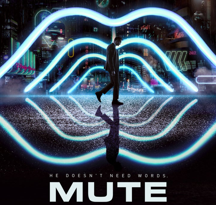
There have been countless posters for Netflix Originals that have been beautiful works of art and then the actual content has been bad. (See the "Mute" example above, as that movie earned a 15 percent on Rotten Tomatoes.)
You really can't tell whether something is actually going to be worth your time from any Netflix promotional material. I keep getting excited about Netflix projects I shouldn't be caring about at all.
I just hope I can some day figure out how to stop getting tricked by Netflix. Until then, I'll just keep streaming and hoping I'm getting Netflix's best.


