Charts tracking public sector (and private sector) pay over the last 12 years explain exactly why so many industries are striking right now.
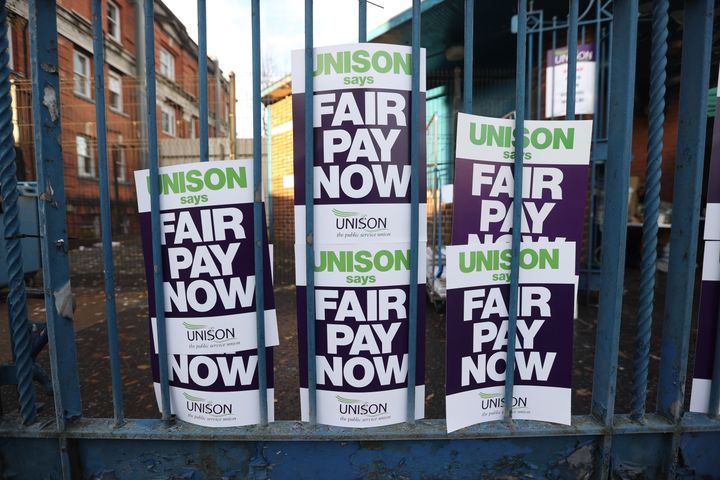
From December 13 onwards, there will be an industry striking on every day for the rest of the year, including railway workers, nurses, Royal Mail employees, border force workers, driving examiners, teachers, ambulance and bus drivers.
All the unions are calling for an increase in pay and an improvement in working conditions.
However, the government has repeatedly refused to negotiate substantial salary increases in line with inflation, claiming it would trigger a wage-inflation spiral, only worsening the current economic woes the country faces.
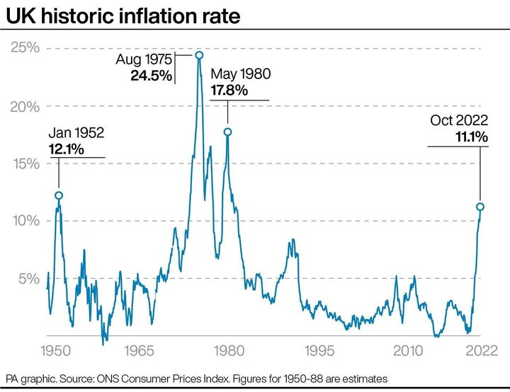
Inflation is already at 11.1%, a 41-year-high, and the cost of living crisis is squeezing budgets up and down the country.
Striking workers say climbing prices mean they cannot afford basic necessities, and blame years of austerity for depleting the value of the wages.
BBC Newsnight’s economics editor, Ben Chu, highlighted on Twitter just how much wages in both the public and private sector have changed over the last 12 years.
Looking at new data from the Institute for Fiscal Studies, it suggests that when average weekly earnings are adjusted for inflation, total pay in the public sector is around 5% lower than the current 11.1% rate.
This works out to a take-home salary of £597, versus the equivalent of £626 per week back in 2010.
Compared to 12 years ago, private sector pay has increased 2.6%, but public sector pay is down 8.15% – though Chu points out much of this decrease has occurred since February 2021, as the UK struggles to readjust after the pandemic.
Still, the ONS revealed in November that the growth in average total pay (including bonuses) was 6.0% and excluding regular pay was 5.7% between July to September.
While this is the strongest growth in regular pay outside of the pandemic period, it is still a long way off the double-digit inflation numbers which has been around since July.

