For many years, data visualisations have been transforming the way people see and understand data. Looking back at the history of data visualisation helps us in our work today. It reveals the core reasons that people visualise data: to change the world. It also teaches us that the most effective visualisations are ones created by engaged, driven individuals. There are centuries of examples, but in this post I want to narrow the field to Victorian data visualisation, perhaps in the 1850s, within the field of medicine and healthcare. This brings us to two of the most prominent historical examples in the field - Florence Nightingale's rose, or 'coxcomb', diagrams, and John Snow's cholera map.
The Cholera Map
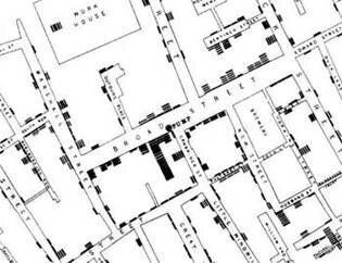
One of the most frequently cited data visualisations, John Snow's cholera map changed the world. In 1854, there was a severe outbreak of cholera around Broad Street in London (now Broadwick Street) with 127 people dying of the disease within the first three days. At the time, the belief was that cholera was spread by "miasma" (dirty air), but John Snow, a nearby physician, believed the disease was transmitted through unclean water. Snow collected data about where the people who died had lived and which pump they used for drinking water. Realising that all the deaths centred on a pump in Broad Street, he then persuaded the council to remove the pump's handle, helping to prevent further deaths. Snow later drew a map which conclusively proved that it was the water from the pump and not dirty air that caused the cholera outbreak. This caused a paradigm shift in the understanding of cholera and eventually led to the construction of the London sewage system. By using the power of data to illustrate the link between the water source and the deaths, the doctor helped to end the curse of Cholera in London and around the world.

The Lady of the Lamp
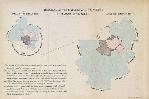
Florence Nightingale will forever be a Great British heroine for her care of British soldiers in the Crimean War, but she's also a hero of mine for appreciating that people need to see their data to understand it. After arriving in the Crimea (only weeks after John Snow's map had helped London to avoid a disease disaster) Ms Nightingale found herself working in military field hospitals with appalling sanitary conditions. In these facilities soldiers were far more likely to die of 'preventable or mitigable' infectious diseases than they were their wounds, or indeed any other reason. By making sure that the hospitals used some straightforward methods to improve hygiene, she drastically reduced the number of deaths from disease.

In 1858 she was commissioned by the government to produce a report on the cause of soldiers' deaths during the war. Armed with the data, Florence created rose or coxcomb diagrams. Her co-author, William Farr, didn't want to include the charts, but Nightingale knew that data visualisations would have a greater impact than tables of data. The charts were published, but what about tangible results? The link between unsanitary conditions and disease wasn't widely accepted at the time, even being shunned by the serving Chief Medical Officer of the time. This visualisation was so powerful that it helped to change the minds of senior officials, arguably paving the way for the complete change of direction in nursing that took place, and saving thousands of lives as a result.
The Lesson?
Over 150 years before computers allowed us to manipulate billions of rows of data in real time, and run all-encompassing reports for multinational companies, data visualisations were already a powerful tool. The data rock stars who used them literally saved lives as a result. In today's world, technology is unleashing creativity, allowing bigger, better, faster visualisations and changing organisations and lives at blistering speed. It's important to remember amongst all of this that all it takes to be a data champion is data, a story, and the will to change things.
