When exploring and sharing data, most people assume it's best to summarise in order to show a story. Surely, they think, reducing your data to the fewest points possible is the best thing to do? I put it to you that this is wrong: why only show a summary when our brains are perfectly capable of processing very complex, granular data?

(Image courtesy of New York City Department of Transportation)
Let me work through an example. I was recently working on a project to explore New York's Citibike data. Citibike is the Big Apple's bike rental scheme. Anyone can join the scheme and pick up a bike from one of 340 docking stations. They ride the bike and dock it at the station at their destination. Each ride is logged, along with demographic information about the rider. With this data, what is the finest level of detail we can show and still tell a great story with the data?
Is it one data point? What's the total number of journeys in my database?

There are 10.3 million records in my dataset. That's not very useful.
How about 7 data points? Here's total journeys by day of the week:
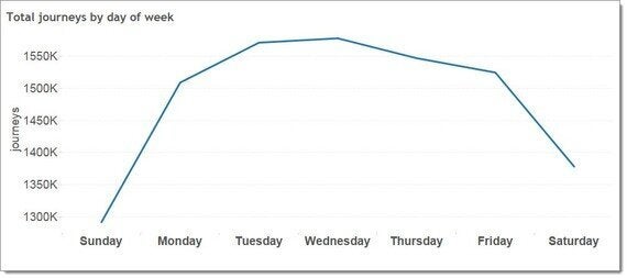
There's clear insight here: the scheme is heavily used during the week and only lightly used during the weekend. But surely there are seasonal issues we are not seeing here. Surely we can cope with more detail than this?
Let's double the number of data points to 14. Here's rides per day of the week broken down by gender.
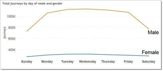
Now we see the daily pattern and also the different usage pattern between men and women. Clearly the Citibike marketing teams need to work out ways of getting more women riding the bikes.
Let's keep going. Here's 24 data points, showing the total number of journeys per hour of the day.
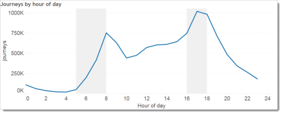
What pops out here is the power of the commute. The two peaks represent the commuting peaks and we can see that more people prefer to ride in the evening than the morning.
Let's double things again, up to 48 data points. I've broken down the hours per day by age. The top line is riders under 40 years old and the bottom line is riders of 40 years and older.
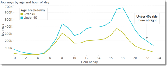
There are more under 40 year olds, clearly. At first glance it looks like both lines have the same daily pattern, too. But look at what happens during the night: those under 40 keep riding through the night.
At this level of data points, we're getting nice summaries of the data, but how can we show more detail and still retain clarity? Let's crank it up to 427 data points: one for every day in the dataset. Below is a highlight table with one mark for each day. It's coloured according to the number of journeys on that day.
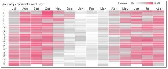
We're getting somewhere now. We can see the light grey during the winter months when very few people ride. We can also see the weekend and weekday trends in October and July as the commuters get on the bikes. We can even identify the peak riding days.
But I still think we can go further. A square for each day feels like an oversimplification.
Let's explode the data and crank it to 10,246 data points. Will that be too much? Every hour of every day, all in one chart? Here it is:
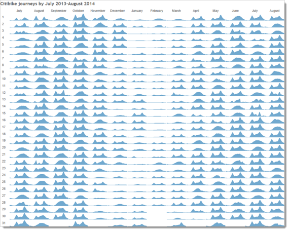
10,000+ data points can be processed perfectly well by the human eye. In fact, this view is incredibly rich and easy to process and invites exploration. What's incredible is that our eyes are evolved to see and work with this level of detail. We can easily cast our eye around and explore.
Can we see the difference between weekends and weekdays? Yes:

The same is true when we explore trends for seasons, or holidays.
We've looked at different levels of detail. Each one shows something interesting. My recommendation is to be brave and keep adding more detail. When you have a question, drill in. Small multiples such as the one above are extremely powerful and shouldn't be avoided for fear of complication. Whether or not they end up in your final reports, small multiples help you see as much of the data as you can.
For some more information and animated version of these charts, go check out my gravyanecdote.com blog post, "How many data points are too many?"
