Let me start with a controversial statement: all data visualisations are manipulative. To give you an example: Have you ever seen the Rabbit-Duck illusion where the image switches back and forth from being a duck to being a rabbit? This shows how profoundly the design of illustrations can influence audience perception. The same is also true for visualisations of data sets. But then again, shouldn't we ask whether these visualisations are meant to manipulate in order to present data in a certain way?
We find it very hard to process large amounts of text information and at this point, data visualisation comes to our rescue and allows us to interpret many data points simultaneously. Having said that, a pretty picture alone is not what makes the visualisation a valuable asset. Keeping in mind the Rabbit-Duck illusion, the context in which data is visually presented is very important too.
Knowing the message you want to be communicated by visualising data is not only the key to success, it should be the starting point for every dashboard creator - in the same way it is for an author writing a novel. Even the title of the chart plays a pivotal role. It sets the agenda for the image and controls the message that is conveyed. Let me give you an example: imagine a chart about the effects of bird flu on the population. We could choose to call it either 'Bird flu kills more women than men' or 'Bird flu deaths on the decline'. Both could be true, however the message is dramatically different. Depending on what purpose is intended, the title can be a very powerful tool to influence the audience.
Colour choice is another feature that can influence your audience. Red, for example, is commonly associated with love, anger, alert, high importance and blood whereas green conveys positivity, good results and calm. If we stick with the bird flu example above, a red chart would certainly enhance the gravity of the fact that more woman are killed by the disease.
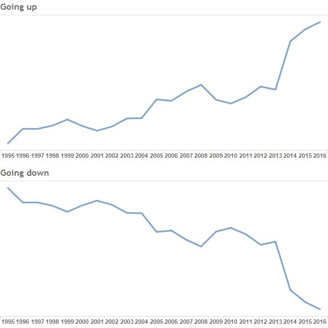
The layout and arrangement of elements and graphs is another crucial factor in creating effective dashboards. Again, learned schemes play a vital role in this area. By way of example, upward-facing charts are generally perceived as positive, whereas downward-facing charts imply negative development. Simply exchanging those roles leads to a completely different interpretation of the picture.
The two data sets above are the same, but in the lower graph the axis is reversed. It might be that a reduction is a good thing in your business, but, at a glance, it is perceived as a negative trend.

These examples show how closely related data visualisation is to intuition, association and other psychological factors. There are a lot of pitfalls on the way to creating trustworthy visuals. Knowing your audience, asking the right questions in order to receive valuable results and being aware of the peculiarities of design, help to make graphical data processing clear and efficient.
The main purpose of the chart or dashboard creator is to ensure that information is presented in a way that is clear, easy to understand and non-ambiguous. Then again, it is the responsibility of the audience to look behind the pretty picture and question what they see. Remember: all data visualisations are manipulative!
