Don't let a small living room be the bane of your home life or the Achilles heel of your future design plans. You can have just as much fun with style and furniture even within the confines of a small space - you just need to spend a little more time in the planning stages, rather than jumping straight in. After all, you'll end up with a more resolved living room rather than one that is haphazardly put together. So, channel your inner space saving god or goddess, and consider the following points to redesign a small space with maximum impact!
1. Employ a light colour palette
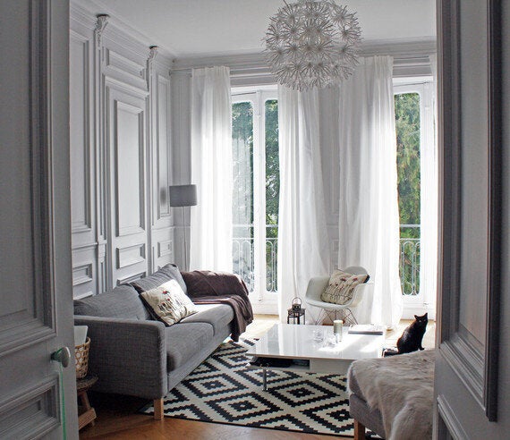
Photo credit: Matin De Mai
An age old rule, and what may seem like a given, but employing a pale or light colour scheme can work wonders for your small living space. The idea is that the available light is reflected off of these surfaces rather than absorbed, hence the illusion of a bigger room. If you are concerned about the space looking sterile and boring, don't stress. It's all about texture rather than tone. Think about cosy materials such as wool, faux fur and linen, and don't be afraid to introduce pillows to create an added illusion of warmth and cosiness.
2. Be inventive with storage ideas
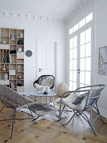
Photo credit: House Envy
Clutter is the enemy of those who are bequeathed with a small living room, so after you've considered the furniture elements in the space, you must pay attention to your means of storage. Piles of books and magazines, or just mess in general, is a total space deterrent. When objects are neatly arranged and in order, it will automatically feel more spacious and open. It also means the more expensive pieces of furniture in the room remain the focal point, which is always what you want.
3. Floor to ceiling bookshelves
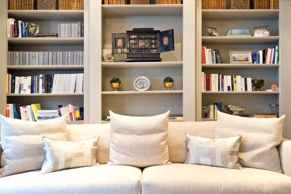
Photo credit: Ardesia Design
By installing shelves up high on the wall, preferably below the cornice level, you instantly add height to the walls as subconsciously our eyeline is draw upwards to the detail. This is especially so if the colour palette and amount of decoration elsewhere is limited. Don't over do it though, keep it simple. Overfilling the shelves and adding too many rows can have the opposite effect, and go against the notion of avoiding clutter in point 2.
4. Use stripes as a geometric illusion
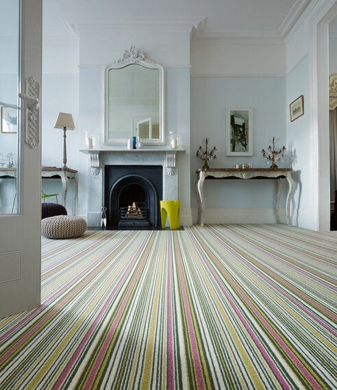
Photo credit: Wools of New Zealand
As fashion teaches us, stripes are a great way to fool the eye into thinking something has more breadth and width than it really does. When used as a carpet, rug or runner, the effect of stripes on a space has a far bigger impact than we might initially have thought. You don't need to be too precious about the colour combination, but do take care in ensuring it isn't a collection of dark tones. Of course, you can inject a bit of colour and personality here, but be mindful and make sure it is broken up by lines of white and beige.
5. Choose window dressings carefully
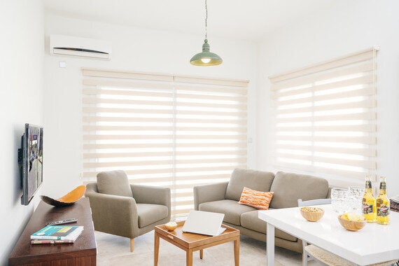
Photo credit: Kibris Developments
It may not be the best solution for some climates, but leaving windows undressed instantly adds more depth. For those that are concerned about heat loss and privacy, you should choose venetian blinds or shutters to retain as much precious space as possible. Steer clear of heavy drapes, bold colours and patterns, and if possible avoid adding any bulky pelmets. If you absolutely must have curtains, keep the colours light, airy and sheer.
6. Light from within, not from above
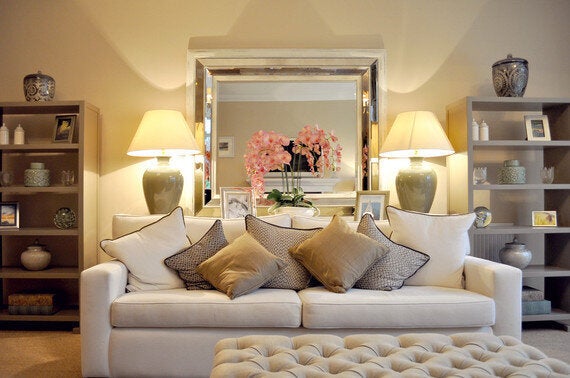
Photo credit: George Buchanan Architects
When considering lighting options, our first port of call is always to light from above. But this may not necessarily always be the best fit. If you think about it, a light bulb or chandelier focuses and centralises the light to one point. Creating a halo effect, it leaves the areas that the light doesn't touch in the shadows or in darkness. To avoid this uneven dispersion, change the way you think about living room lighting. Create a more dramatic effect by having multiple light points around the space, causing the eye to wander from corner to corner. Alternatively, add warmer lights to peripheral points and light with a clear white light bulb over yellow or opalescent.
7. Mirror, mirror
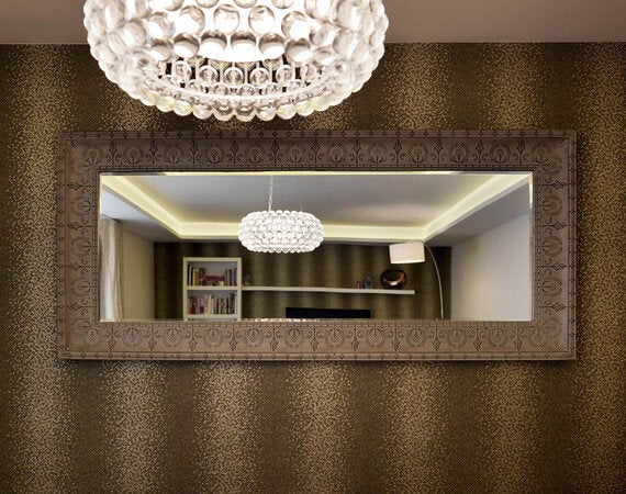
Photo Credit: Living In Space
Another space hack we've come to adopt in recent years is the use of mirrors. More often than not, they are spied in hallways, entrances and above fireplaces and mantels, but why not use them to a completely different effect? In lieu of art, why not frame a mirror with an ornate and intricate border? You may think this is a little strange, but don't forget - once the room is full, there will always be something on view in the reflection of the mirror. One thing to keep in mind is the position. Ideally, it should be directly facing a window or light source. You want to be able to reflect as much light as possible, and illuminate all those hard to reach places.
See, after all that, it isn't necessary to throw your hands up in defeat when you have a small living room. There are many quick, easy and cost effective solutions at your disposal - you just need to know about them first!