Anyone following the economic and political debate in recent years will have found it hard to escape the fact that the price of essentials is rising. While most have accepted this as a given, and policy makers have been tussling to tame the rises, what has been missing from the public debate has been hard evidence on precisely how much these rises have impacted households over time.
There is no doubt that data aficionados will have pored over the annual Family Spending publication of the ONS, but the detailed breakdown of results has often failed to penetrate mainstream debate. Thankfully, the ONS (which should be congratulated on their refreshing new approach to data visualisation) has begun to turn that tide with its recent report on household energy spending.
The report shows that average monthly spend on household energy rose by a staggering 55% in real terms between 2002 and 2012 (the ONS infographic is copied below).

Since households towards the bottom of the income distribution spend a higher proportion of their budgets on essentials, the impact on these households has been higher. The report shows that, in 2012, the poorest fifth of households spent some 11% of their disposable income on household energy bills, compared with just 3% for the richest fifth.
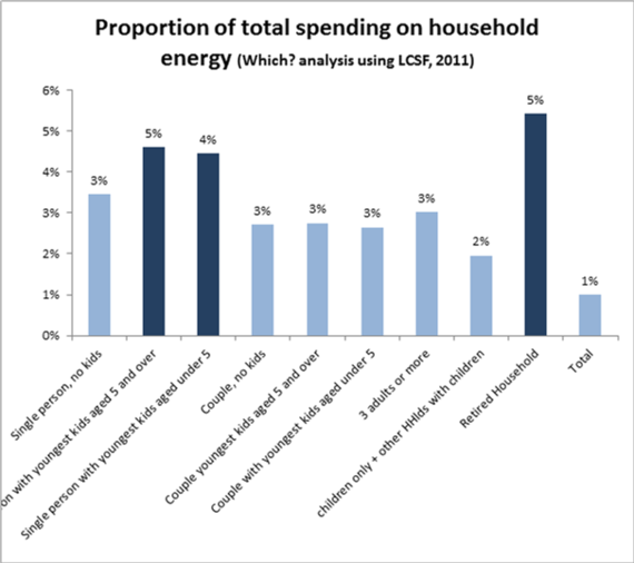
Having these data is a big step forward in terms of understanding the pressures on household budgets and why the government is right to be trying to tackle the underlying reasons for ever-higher energy bills (and why Which? is arguing that more can and should be done at the Budget 2014). However, we still need more data to be able to understand the range of impacts that the rising cost of energy is having. By taking the underlying data from the Living Costs and Food Survey in 2011 (until new data are released later this year, this is the most recent available to those outside of the ONS), Which? has also looked at how rising energy costs have impacted different types of household. Again, this shows that different households are affected in different ways - with lone parent and retired households having the highest proportion of their budgets taken up by energy spending.

As well as getting beneath the headline figures, if policy is going to be based on a good understanding of the data, we also need to recognise that the current data still says nothing about how things have changed in the last two years.
To get a better understanding of this, we can look past official data and use a range of consumer insight tools. Which? does this both through our consumer insight polling of a nationally representative group of 2000 individuals and through our Spending Power Index.
The latter of these models how consumer spending power has been impacted by changes in the prices of things that households are buying and how their incomes have grown. Rather than broader measures that capture the "average" basket of goods, it uses measures of the actual basket of goods that different households are buying. By doing this we see that, while rises in incomes have significantly boosted spending power over the last year, increases in the costs of energy and housing have reduced spending power of the median household by 0.6%. For those in the bottom fifth of incomes, the hit on spending power from rising energy and housing costs was nearly 1% in the last year.
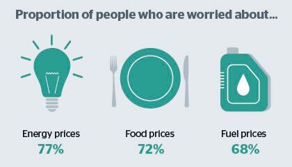
As the rising costs of essentials continues to hit households, it is no surprise that our insight polling also highlights problems and worries in this area. For instance, energy prices have been in the top three consumer worries since our polling began in September 2012. Nearly eight in ten consumers still say they are worried about the price of energy.

Our analysis also shows that consumers are not happy with the way that companies delivering their energy are treating them. Nearly half of people do not trust gas and electricity suppliers to act in their best interests and, following a Which? campaigning for data on customer complaints to be released, in the first full year of official figures from the six biggest energy companies, we see that more than 5.5million complaints were made in 2013 alone.
By combining national datasets with our consumer insight we can begin to get an understanding of the full impact of the rising costs of essentials. Doing this shows that households have been hit by rising costs of essentials for many years and that these trends do not yet seem have begun to reverse. This highlights the very real need for policymakers to focus on helping keep household bills in check. As my campaign colleagues have been arguing, doing so will require action to Fix the Big Six.