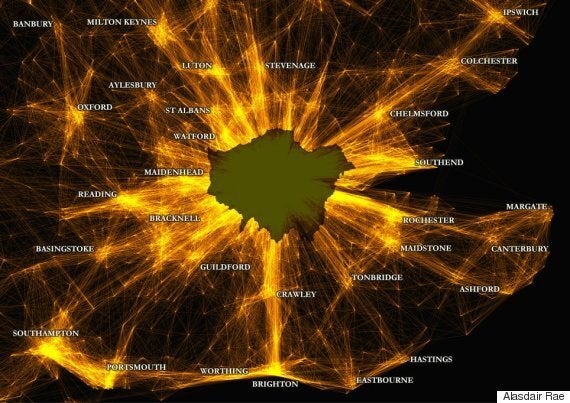
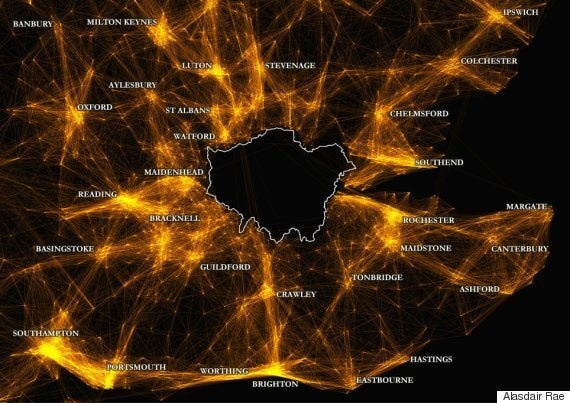
The fact that London is booming is hardly news, yet we often overlook the connections it has with other places that actually make it work. One important part of this story is London's daily commute - a major reason why the city's population swells to over 10 million each weekday, according to figures released by the London DataStore.
Seen in this way, we might think of London as a city that acts a little bit like an exploding star every evening: a kind of 'supernova city' perhaps. I use this analogy with tongue firmly in cheek but when you look at the images below - animated and static - it's clear that that the interstellar references retain some relevance.
These images are based on commuting data released earlier this year by the Office for National Statistics and show the commuting links between different cities in London and the south east. The point here is that, seen in this way, London is very much the 'mega city' depicted by the late urbanist Sir Peter Hall in his study of urban mega city regions of Europe. The other point is that the drudgery of the daily commute actually results in some quite striking images.
Let's begin with some basic numbers, to give an idea of the scale of the daily commute in and around London. Westminster's daytime population swells to over one million, including tourists, in contrast to its resident population of around 225,000 people. This equates to roughly the entire population of Birmingham, but in less than a tenth of the area.
The City of London, on the other hand, has a very small resident population of around 8,000, but a total daytime population of over 600,000 - more than 75 times as many. The challenges this daily shift in population presents are all too evident, and this emphasises the important role urban planning and infrastructure provision have to play as our towns and cities continue to grow.
The sheer magnetism of the City as a place of work is hardly surprising but when we look at the scale and distance of commuting to the City, it's really quite striking. For example, the animated gif below shows all commuter flows of 25 people or more to the City of London - and then back again. Major motorways, green belt land and some key towns and cities are shown on this map in order to provide a little context.
Commuting to the City of London (one dot = 25 or more people)
Data source: Census, 2011
When we look at commuting flows in London and the south east of England more broadly, we begin to see a highly interconnected mega city region, with other parts of the country being drawn in. Beyond the boundaries of Greater London, the South East provides over 400,000 workers and the East of England region another 300,000 more. Some of this movement is captured in the commuting constellation map below, where once again London dominates. In these maps, each line represents a commuter flow of at least 10 people.
But this isn't the whole story. Yes, London is a major world city and it acts as the hub of our economy but the wider South East region is an important 'polycentric urban area' in its own right, as Sir Peter Hall noted in his Polycentric Metropolis book with Kathy Pain in 2006. The Royal Town Planning Institute are due to publish a study on this topic in the near future, but to provide a little more insight I have produced one final map with all commuter flows to and from London taken out. Yes, London might be the brightest star, but it's by no means the only one.
Commuting in London and the South East - flows of 10 or more

Data source: Census, 2011
Commuter flows, excluding London - flows of 10 or more

Data source: Census, 2011
What conclusions are we to draw from these pretty pictures? For me, it comes down to three things. First, it's not all about London or, indeed, the South East of England, but about understanding how our constellation of cities and towns depend upon each other. Second, the kinds of images presented here can help illustrate important stories about our world and about our daily lives, but they can never tell us what to do about it. Finally, the importance of urban planning - at the right scale - is critical. These flows of people depend upon efficient, effective infrastructure planned and provided for at a national level. Anyone who is represented by one of the dots or lines on these maps would note that their commute is often less efficient and effective than it ought to be. If we don't plan properly, then, London may very well become a kind of 'supernova city'.
Alasdair Rae is a Senior Lecturer in Urban Studies and Planning at the University of Sheffield. He has a PhD in urban planning and blogs at www.undertheraedar.com
Links
London Datastore daytime population data:
RTPI Uniting Britain (2006) the concept of the 'London Supernova' was first proposed in this study: http://www.rtpi.org.uk/media/6003/Uniting-Britain.pdf
Data used to create the maps: