Those of you who’ve been watching the Paralympics will know that ParalympicsGB is winning medal after medal in the games.
Originally called The Stoke Mandeville Games, the tournament we now know as the Paralympics first began in the opening ceremony of the London 1948 Olympics ― so perhaps all those wins are fitting.
Though the first official Paralympic Games took place in Italy in 1960, the first Paralympic logo didn’t appear until 1988.
Five curved motifs, all in the same colour as the Olympic rings, were firs used until 1994, and since then, the design has changed twice.
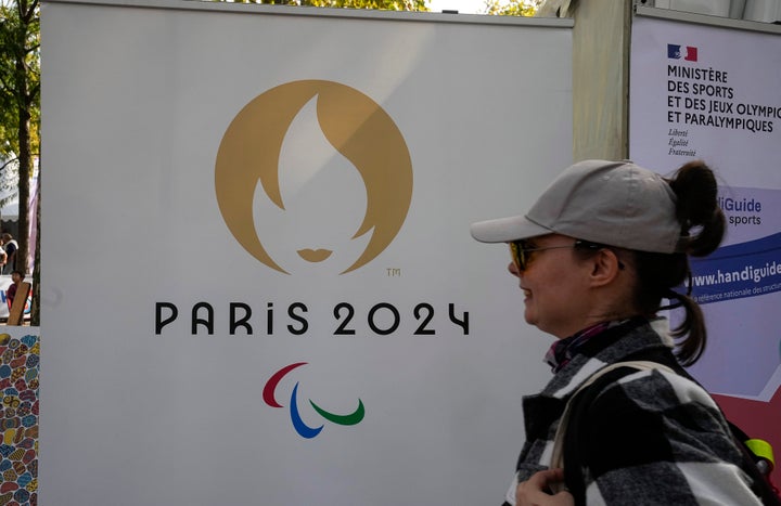
It now consists of three overlapping, slanted red, blue, and green curves.

What does the logo mean?
Per the International Paralympic Committee’s site, the original 1988 logo was made up of five Tae-Geuks.
These Korean motifs refer to “the ultimate reality from which all things and values originate,” they say.
These five Tae-Geuks first came in blue, black, red, yellow and green.
In 1994, these were cut down to three, with only the green, red, and blue ones remaining, representing the “mind, body and spirit”.
By 2004, the three Tae-Geuks had morphed into a more circular style but had maintained the same colours. The logo was named Agitos (as it still goes by) and its more dynamic design came with the motto, “Spirit in Motion.”
The 2019 Agitos update gave the logo bolder colours to “match the vibrant Paralympic values.” They also changed the red, blue, and green in the logo to match the Olympic version “In the interests of sustainability and reducing ink when printing.”
The updated Agitos logo’s motto is, “Change Starts With Sport.”
Why did blue, green, and red stay?
According to the International Paralympic Committee, that’s partly down to a numbers game.
After all, red, blue, and green are “the three colours that are most widely represented in national flags around the world,” they say.
Part of the 2019 update involved getting the curved, coloured slashes to dash around the same focal point.
This references gathering the Paralympic athletes together for the Games and “emphasises the fact that Paralympic athletes are constantly inspiring and exciting the world with their performances: always moving forward and never giving up.”
Lastly, the logo’s name, Agitos, comes from the Latin meaning “I move.”
Neat, right?