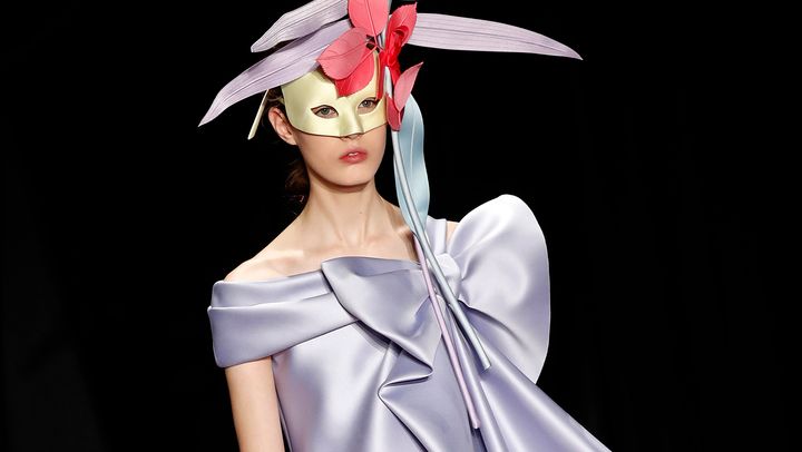
Lilac. It’s a bit like marmite – love it or hate it.
Tipped to be the colour of the summer, lilac was huge on the runways and will soon be all over fashion editorials, but will it make its way into your wardrobe?
While for young designers and buyers the colour appears ripe for exploration, for the more seasoned fashion buyer it is more likely to bring on a cold sweat. And there’s a good reason for this uneasiness. Lilac products have historically been a key feature on sale rails, so in the minds of buyers the colour is intrinsically linked to a hard sell. It’s also difficult to pinpoint exactly who wears the pastel hue.
And it’s not just designers that have a hard time with lilac. Ask yourself what the colour makes you think of and any of the following might enter your mind: Parma Violet sweets, the older lady, unicorns?
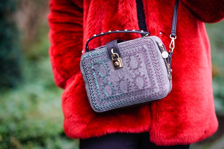
The next question is how to wear or use the colour. On the S/S18 catwalks, both Joseph and Max Mara went for full on lilac, exploring tailoring and statement jackets. Taking a subtler and commercially safer approach, brands like Victoria Beckham and Creatures of Comfort opted for lilac footwear, while Acne, Michael Kors and Emporio Armani applied lilac to accessories, tapping into the trend of sugary pastel shades that has been bubbling away in this category.

Colour history is fascinating. Not only is there the psychology behind it, but colour can also be a good barometer of the times from a cultural or political standpoint. So, it’s no surprise that this year we’re seeing designers cajole a spirit of optimism through their colour palettes – a theme that has been bubbling away for some time with designers increasingly taking more activist and inclusive stances responding to dark and uncertain times.
Yellow is a prime example. It’s bold, it’s bright and it’s positive. Yet until only a few years ago, yellow was hardly to be seen on the catwalk or in mainstream fashion. While it stepped onto the runway in mustard shades back in A/W13, it has taken a long time to evolve into the statement Sunflower shade we saw in S/S18 collections and which we expect to see return for A/W19/20. But while yellow is having a moment, it’s really all been – and will continue to be – about pink.
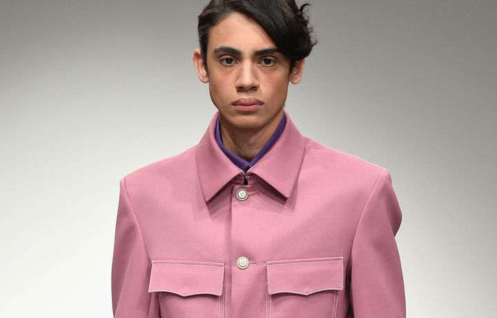
While Pantone’s colour of the year for 2017 might have been Greenery, for many, it will forever be known as the year of Millennial Pink, which hailed from the Pantone colour for 2016 Rose Quartz. This infatuation was much easier to predict because of the sentimentalities attached to the colour, including comfort, childhood and sweetness. It’s also a much more flattering tone for more skin tones. The stereotypes attached to pink only being for girls are also increasingly – and importantly – being rewritten, which also helped to broaden its appeal.

It’s why pink is here to stay. The most recent runways have shown that the success of Millennial Pink shows no sign of abating – it’s just getting a revamp for a new season worked with bolder shades of strawberry and watermelon pinks.
So, while Pantone’s colour of the year for 2018 – a bold purple called Ultra Violet – is on point in its messaging of power, positivity and optimism, it offers a troublesome colour palette for designers. Could Lilac or Ultra Violet ever come to represent the colour preferences of an entire generation in the same way Millennial Pink did? It seems unlikely.
So, when planning your new Spring wardrobe, I would say tread with caution. Although lilac might look good on the runway right now there’s a high chance it will be a one-season affair.
