Whether you’re painting the walls or adding a few statement accessories, the colours you use to decorate your home can change the look and feel of your hideaway.
For the past couple of years, our Pinterest boards have been dominated by Scandi interiors with grey, muted tones. But 2019 will represent the “re-emergence of colour”, according to Harriet Forde, President Elect at the British Institute of Interior Design.
“Think dark, moody and smoky interiors,” she tells HuffPost UK. “It seems we have reached the point in the design cycle where the arrow is pointing to 1970. Probably all a backlash to the beige, taupe and grey of the last few years.”
With that in mind, we asked interior designers for their top colour predictions of next year.
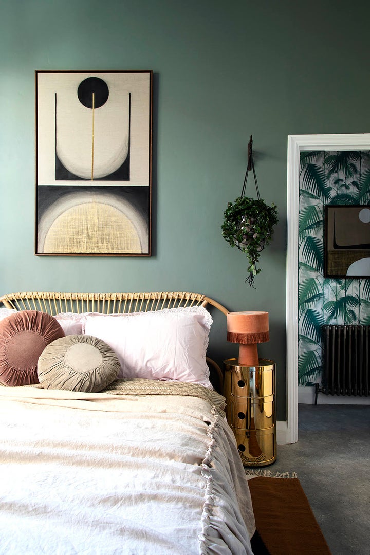
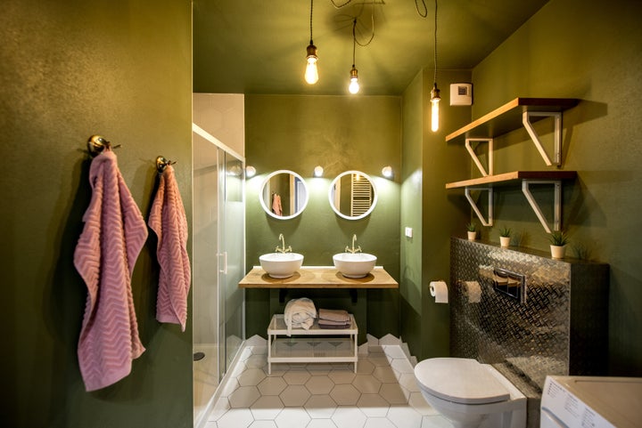
Green With Envy

Green was the colour favoured most frequently by the designers.
Anna Burles, creative director at interior design company Run For The Hills, predicts the global botanical trend will continue, but our love of palm prints and plants on every imaginable surface will mature. She expects we’ll see walls “painted shades of beautiful botanical greens, ice dusted rosemary and dusted chocolate bark browns”, making rooms appear “dramatic and rich, but ultra natural and organic”.
Similarly Kate Butler, head of design at homeware store Habitat, says 2019 will be “all about green” and bringing the majesty of the forest inside. She recommends pairing forest and olive green shades with earthy colours like tan, clay and terracotta. “The result is very sophisticated and quite luxe. This also works really well with warm tones of walnut and brass,” she says.
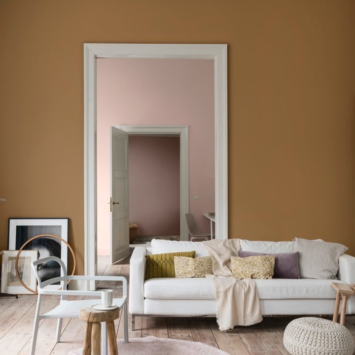
Good Enough To Eat With ‘Spiced Honey’

If green isn’t for you it’s still possible to embrace the earthy, natural trend by painting walls a warm brown.
Dulux has predicted the most popular wall colour next year will be spiced honey, a natural, warm brown that looks good enough to eat. The rich caramel tone can be pared with soft pinks, and it also provides the perfect backdrop to make white pop.
“It can be both calming and nourishing or stimulating and energising, depending on the palettes and light surrounding it,” explains Heleen van Gent, head of the Global Aesthetic Centre, Dulux’s colour and trend forecasting team. “The contemporary hue is versatile, sophisticated and timeless and lends itself to a broad spectrum of life and interior styles.”
Pay Attention To Detail With Contrasting Accessories

If you went to town buying blush pink accessories to compliment grey Scandi-inspired walls, don’t worry, your soft furnishings can still work with either of the looks above.
“Blush has become a very sophisticated colour, almost a neutral depending on the tone,” says interior designer Marion Falchi. “It also works with most colours, which makes it so much easier to introduce if you are already working with an existing palette.”
But if you do fancy buying something new, Forde recommends fabrics and accessories in yolk yellow, mustard and turmeric. “Use more muted yellows for a grounding earthy feel and the lighter paler versions for energy and confidence. Both are better suited to soft furnishings rather than walls in my opinion,” she says.
Habitat’s Kate Butler warns “copper is on the out” when it comes to accessories. Similarly designer Brian Lawrence recommends looking out for kitchen and bathroom accessories accessories in pewter, warm zinc and antique brass. Toffee oranges, browns and deep reds get his vote for soft furnishings.