Typefaces are everywhere; they're so deeply ingrained in all our lives that we barely take note of the endless fonts that surreptitiously set moods and make statements. We talked to typography artist Luke Merryweather about the art form's latest leap into the headlines.

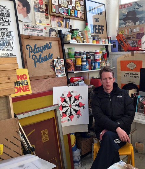
Luke Merryweather in his studio in South East London
Photo by Luke Merryweather
A typeface is made up of a range of fonts in different weights and sizes that share a common overall design. It's almost such a ubiquitous concept that it's taken for granted, but getting it right is a work of art. If the likes of Protein and artists like Lex Wilson are anything to go by, real type is back and making the headlines.
BBC News reported just last week that divers were scouring the floor of the Thames to uncover printing blocks for a typeface called Doves Type, which has not been used for nearly a century. The blocks were thrown into the river in 1917 after a business arrangement turned sour.
Working with type in traditional ways such as Letterpress has an air of mystery around it. It's a tougher world to infiltrate and definitely not as accessible as, say, screen-printing. With the computer age, hand-printed type lost favour with design agencies and publishers, who turn towards digital type in order to meet demand. It also wasn't perceived as very cool for a while, but a few presses kept the craft alive and the letters in use.
Now, after a couple of generations, it's back with a vengeance.
I spoke to typography artist Luke Merryweather - currently exhibiting 'Quarter Lyfe Crisis' at G-SHOCK EAST store on Brick Lane as part of the G-Shock Sessions - about some of the best fonts that are a part of all of our lives.

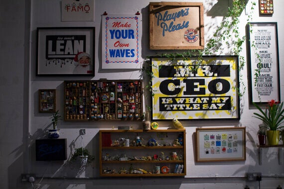
Luke Merryweather's current exhibition, 'Quarter Lyfe Crisis'
Photo by Dominic Davids
Johnston
"This is numero uno; it's the one we Londoners see everyday on the Underground and just screams London. It was created for TfL in 1916 and was also a major influence on a later British typeface, soon to be on the cover of every Penguin book in the land - Gill Sans."

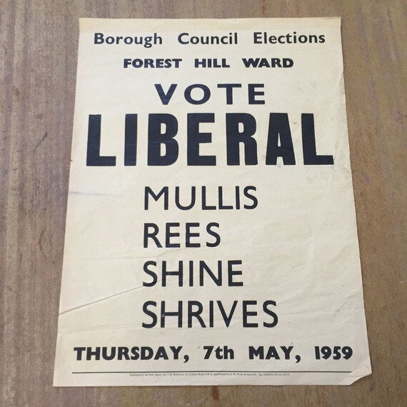
An old election poster using Gill Sans
Photo by Luke Merryweather
The Akzidenz-Grotesk family
"This German face was one of the first san-serif families. Born in the 20th Century, it's now been worked into many weights and forms but still has great simplicity. It's timeless."
Brush Script.
"This scrawly hand-written font is everywhere - builders, hair salons and chicken shops love it. It was used in the 90s for the sadly disbanded Wimbledon F.C 'Crazy Gang' supporters club, which I was a part of."
Bodoni Poster Italic
"It's a real stunner. The lowercase is all fat and squidgy with funny curls and flicks. The bigger the letters are printed the better."
Comic Sans
"I believe it was created to be a friendly interface font for early Microsoft packages, but somehow it got out. The world would be a sadder place without it!"
What's the secret of a good font?
"Bold, strong, simple. It needs to stand the test of time, so nothing too fancy."